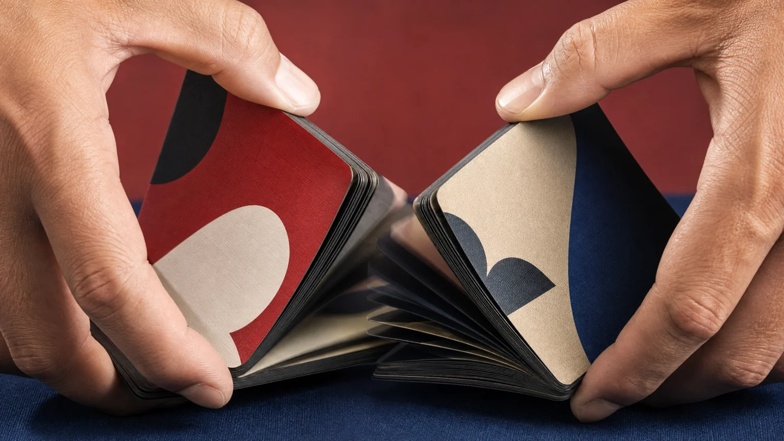
A playing-card deck usually prioritizes instant recognition. Color Index keeps that familiar format, then shifts the point of attention to the space between cards. Sequence, color, and riffle motion become the main visual event, producing an analog animation in the hand.
The project is designed by Julia Schimautz of DTAN Studio with collaborator Small Wonder CPH. Its appeal comes from a clear proposition: each card carries a fragment, and the full image appears only as the deck moves.
Motion is built into the deck
Across the stack, saturated fields of color gradually shift and gather into oversized suit symbols. Viewed one card at a time, each surface feels graphic and complete. Riffled in order, those separate frames resolve into a moving image.
That distinction matters. Animation is not applied afterward as an effect. The movement is already embedded in the object’s structure, while the hand supplies the timing.
Each card acts like a frame, and ordinary handling becomes a brief visual performance.
There is a practical lesson here for identity designers and editors. When motion is planned at the compositional level, it can stay legible without a screen. The same principle appears in digital work when a mark transforms through repeated fragments rather than one dramatic reveal, as in visual signature built from repeated fragments.
Color gives each suit its own territory
Instead of the usual red-and-black split, the deck assigns each suit to a distinct saturated field. That immediately changes how the system reads. Suits stop behaving like binary categories and begin to feel like separate zones with their own character.
This is more than a palette change. A standard deck uses color mainly to sort information quickly. Color Index uses color as both an indexing system and image material, so recognition and construction happen at once.
That double role is what makes the oversized suit symbols convincing. They do not sit on top of the cards as detached icons. They emerge through accumulated color decisions, card by card, until the larger form becomes visible.
Printed matter carries the sequence
Schimautz approaches graphic design through experimentation, imperfection, and the physical behavior of printed matter. Her practice is informed by printmaking and Riso printing, which helps explain why this deck feels grounded in process.
Printmaking rewards iteration, pressure, layering, and slight variation. Those habits suit this object well. An analog animation depends on tiny differences between frames, and print makes those shifts tangible rather than purely optical.
That perspective is useful in a design culture that often treats motion as a software feature first. Physical print can carry sequence, reveal, and rhythm just as effectively. The medium changes the pace of encounter, not the visual logic underneath it.
Designers working across formats can apply the same idea. A poster series, packaging line, or social asset system often gets stronger when parts are designed to accumulate meaning through repetition. The same structure supports logo reveal animation built through gradual construction instead of instant appearance.
Materials make the concept hold up in the hand
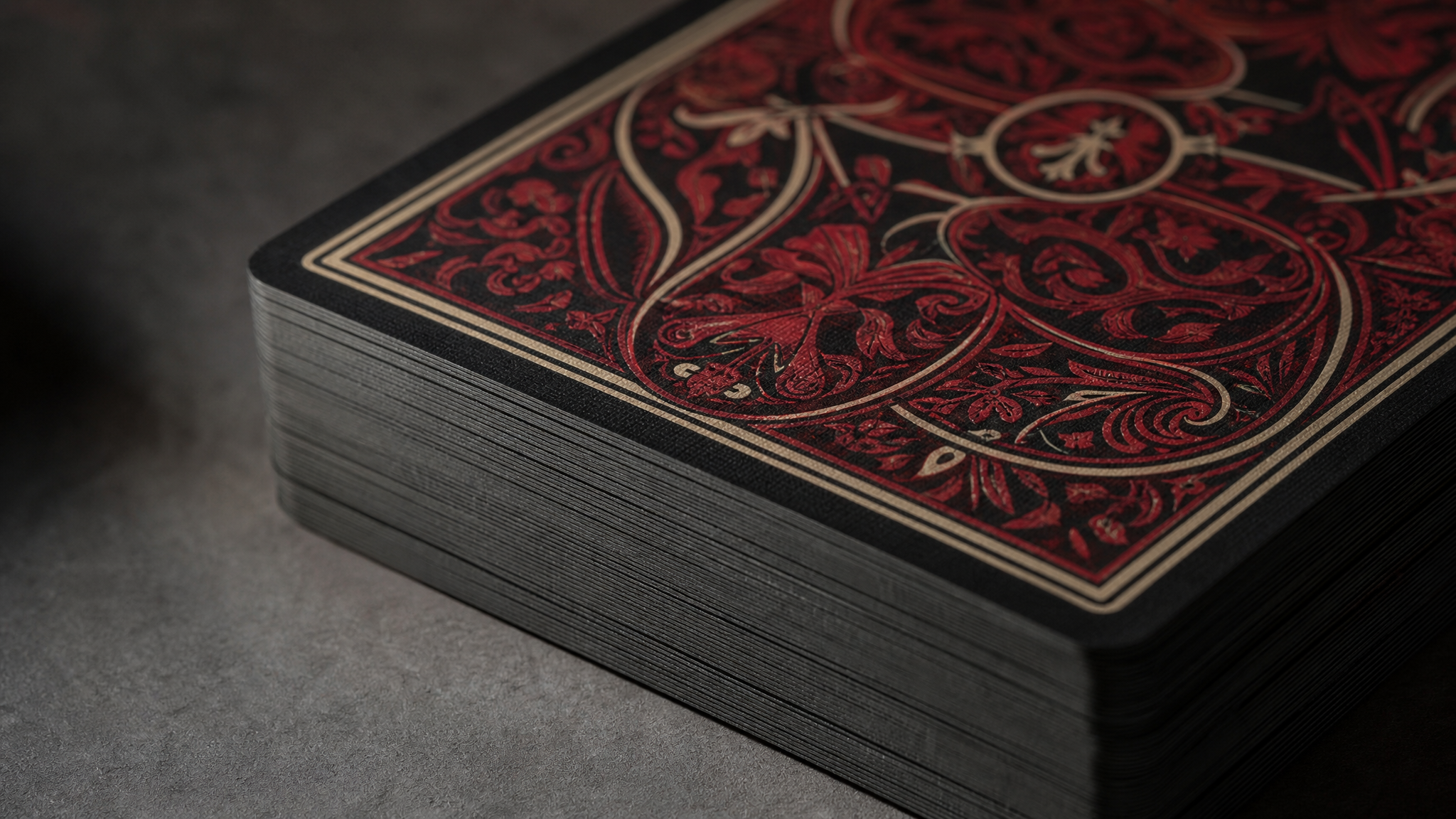
The deck is printed on FSC-certified black-core paper using vegetable-based inks and finished with a linen texture. Those choices shape how the deck is handled, how the cards separate, and how the object registers as something worth keeping.
Black-core paper gives the stack visual density. Linen texture adds a tactile surface suited to frequent contact. Vegetable-based inks and FSC-certified stock place production decisions inside the identity of the object itself.
For designers, that is a useful reminder that material specification is part of the visual system. A concept built on accumulation and motion can weaken if paper, ink, or finish works against the hand. Here, production supports the idea all the way down to touch.
The viewer becomes part of the mechanism
Screen animation usually arrives with fixed timing. This deck asks the viewer to activate it. The image moves only when someone riffles the cards, so speed, pressure, and duration stay in the user’s control.
That shift changes the act of looking. Instead of receiving a finished clip, a person discovers the image through use. The effect is modest, but it stays with you because participation is built into the object.
This is one reason physical systems can feel so memorable. Interaction is not layered on later. It is part of the object’s behavior from the start. Designers looking for digital equivalents often pursue the same quality with seamless icon loops and other small repeated sequences that remain clear over time.
Small changes do the visual work
Color Index does not depend on one dramatic gesture. Its effect comes from many small changes held in order: one field shifts into another, one fragment expands, one symbol gathers over time. That restraint is exactly what keeps the idea clear.
Strong visual systems often work this way. They trust accumulation and let structure carry the message. In this deck, cards, color, materials, and handling all point in the same direction, so the concept stays visible at every scale.
The project is easy to admire because it is also easy to study. It shows how print can hold motion without imitating digital media, how color can classify and construct at the same time, and how a familiar object becomes newly legible when sequence becomes the main design tool.
 Photo Template
 Logo Template
 Icon Template
 Icon Template