

A small line of text can carry enormous legal weight, yet many screens treat it like an afterthought. Courts are increasingly reading that mismatch for what it is: a design decision.
In online arbitration disputes, the question no longer stops with the wording inside the terms. Judges are examining the page around the terms too, looking at clutter, button placement, hyperlink visibility, font size, and whether the interface clearly tells a person what clicking actually means.
That shift reaches well beyond legal teams. It puts visual hierarchy, contrast, spacing, and page direction inside the chain of enforceability.
The full interface is under review
When a page asks someone to subscribe, sign in, create an account, or continue, the click has to do more than complete a task. It also has to show meaningful notice and a clear signal of assent.
The test is surprisingly visual. Is the page clean and easy to read, or crowded with distractions? Is the notice directly above or below the button the customer actually clicks? Does the hyperlink actually look like a hyperlink? Does the sentence plainly say that clicking means agreement to the terms?
Those questions sound familiar because they match the ones designers ask during review. The difference here is consequence. Layout is not just shaping convenience or conversion; it is shaping whether the interface communicates consent in a way a court will accept.
That overlap makes branding language becoming the dispute feel less like an edge case and more like a recurring condition of digital products. Once legal meaning depends on how words appear on a screen, interface design stops being decorative support and becomes part of the record.
Placement carries more legal weight than teams admit
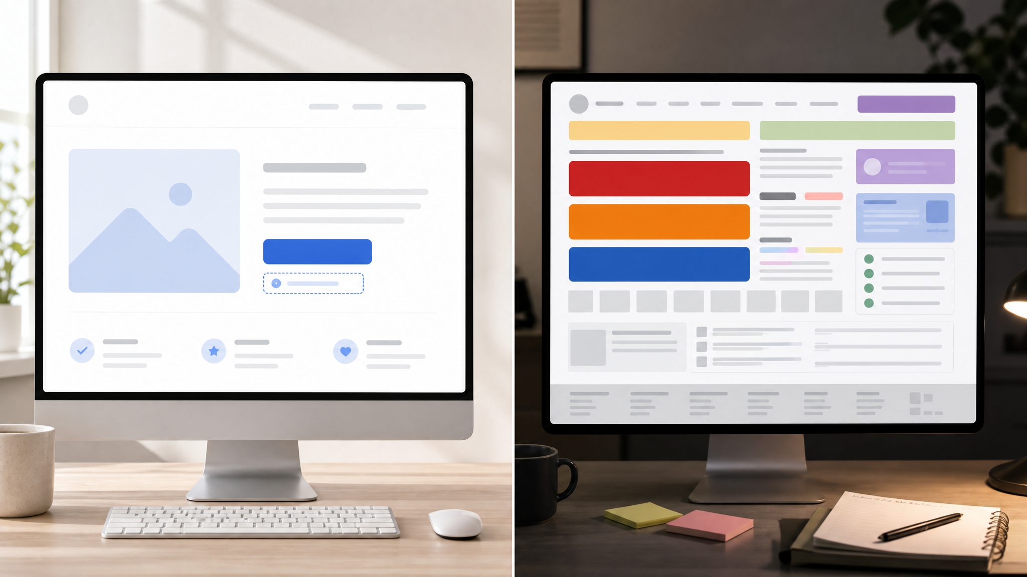
A notice buried in the wrong part of the page can fail even when the underlying terms are strong. Distance weakens association. If the message about agreement sits too far from the action button, or gets split from it by competing elements, the connection starts to break.
That is why courts are paying close attention to placement above or below the exact button a user presses. Nearness creates a readable sequence. The eye moves, the hand follows, and the page establishes timing between notice and action.
For design teams, this is a reminder that flow is evidence. The strongest sentence on the page can lose force if the interface asks the user to process it out of order.
Two 2026 rulings make the difference visible
One appellate case from the Sixth Circuit upheld an arbitration agreement in part because the page made the relationship between the notice and the click easier to read. In Dahdah v. Rocket Mortgage, LLC, 166 F.4th 556 (6th Cir. 2026), the court emphasized a simple page design, the notice directly below the action buttons, and a bright blue hyperlink, even though the text itself was small.
That detail is worth pausing on. Small type did not automatically sink the interface because other cues supported comprehension. Simplicity, proximity, and a visible link gave the page a clear signature.
The Eleventh Circuit example cuts the other way. In Tejon v. Zeus Networks, LLC, 174 F.4th 1322 (11th Cir. 2026), the hyperlink to the terms appeared in small, gray text beneath large red subscription buttons, and the court found it was not conspicuous enough.
These two outcomes do not point to a single magic rule about font size or color alone. They show that courts are reading combinations: button scale, text contrast, visual emphasis, and surrounding clutter. A page succeeds or fails as a composition.
Contrast and clutter can alter legal meaning
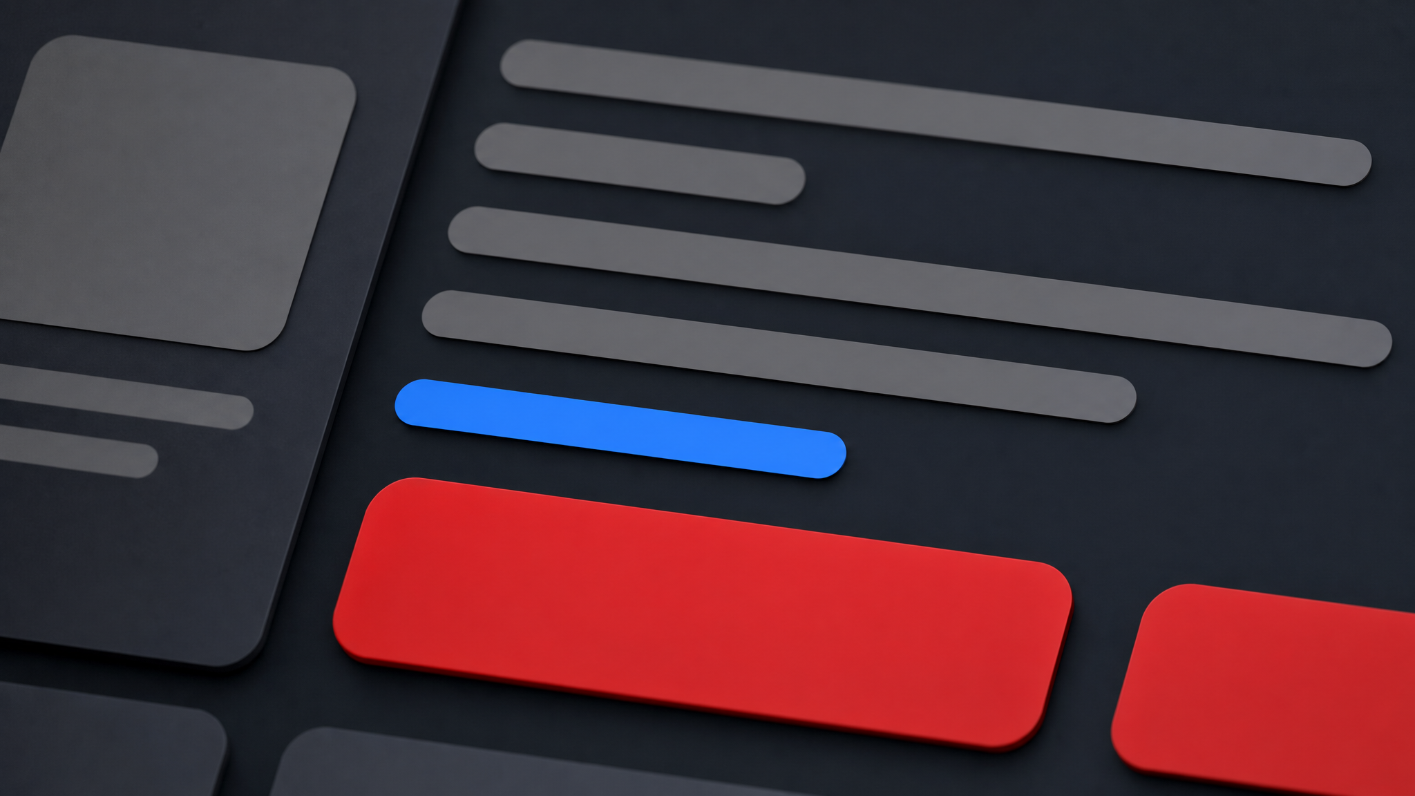
Designers already know that contrast guides attention. In this setting, that familiar principle becomes unusually concrete. A bright blue hyperlink can help a link read like a link, while small gray text under dominant red buttons can fade past notice.
Clutter matters for the same reason. If banners, promotions, badges, and competing calls to action crowd the screen, the terms notice loses legibility even before anyone reads a word. The interface may still function, but its communication grows muddy.
This is one reason visual restraint often performs better than added emphasis. When every element asks loudly for attention, the notice that needs to be unmistakable can become one more voice in the noise.
That design problem echoes a broader lesson in when AI starts recommending the brand instead of ranking the page. Surfaces now get judged as complete reading environments. Meaning depends on arrangement, not just presence.
Clear copy still needs visible support
The text must expressly say that by clicking, the user agrees to the terms. That verbal clarity remains central. But words alone cannot carry the burden if the page visually hides the relationship.
A useful way to think about it is simple: the sentence states the consequence of the click, and the layout makes that consequence hard to miss. Neither part should have to rescue the other.
- Use direct language that states clicking means agreement to the terms.
- Place the notice immediately next to the action button rather than elsewhere on the page.
- Make the hyperlink look unmistakably clickable through color and standard link styling.
- Reduce competing visual elements near the moment of consent.
- Check the page as a full composition instead of auditing copy in isolation.
These are ordinary interface habits, but here they do uncommon work. They help the screen show what the click signifies.
Review the consent moment before a dispute does
Legal enforceability is pushing counsel and web designers into closer collaboration. Terms need to be conspicuously disclosed, and a cleaner flow with clear language, clear placement, and clear visual cues materially improves the odds that a court will find notice and assent.
That does not require dramatic motion or a theatrical interface. It usually asks for the opposite: fewer distractions, stronger contrast, and a clearer path from explanation to action.
For teams building product screens, subscription flows, and checkout experiences, the implication is practical. Treat the consent area like a high-stakes interface component, not a leftover footer problem. Audit the page with fresh eyes and ask what the screen makes obvious, what it softens, and what it accidentally hides.
If you need to test emphasis in a consent-heavy interface, even simple studies in animated icons for websites or subtle cues from animated interface icons can help teams compare attention patterns without rebuilding the whole page. The point is not decoration. It is clarity at the moment a click starts carrying legal force.
 Logo Template
 Photo Template
 Photo Template
 Photo Template


