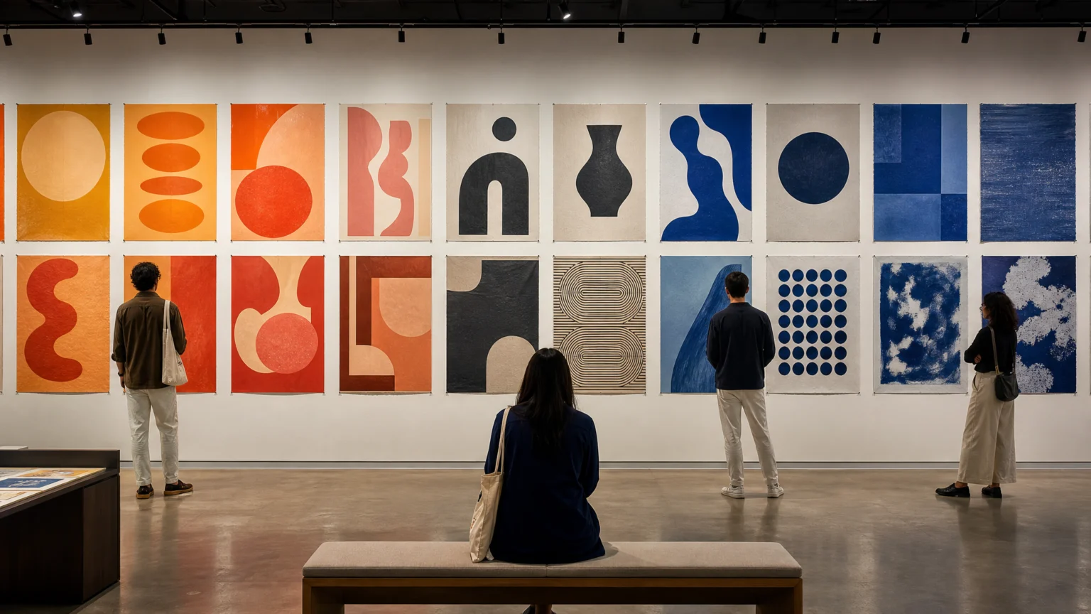
The eye makes an early choice in a poster room. Before any headline is read, it registers temperature, contrast, and density, then starts sorting meaning from there.
That is what makes A Tiny Fainting Spell: Posters Seen Through Color such a useful design case. The exhibition gathers posters from the HMCT Archive at ArtCenter’s Hoffmitz Milken Center for Typography in Pasadena and organizes them through color rather than chronology, authorship, or subject. The result puts visual response up front, where many designers actually begin.
Color makes the first cut
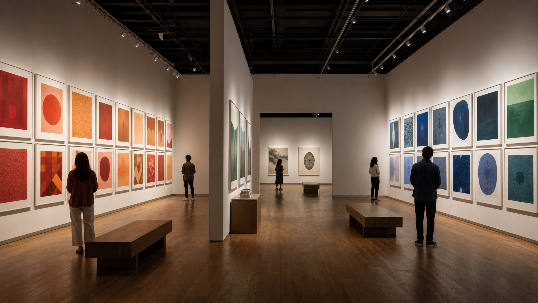
The curatorial method was almost completely intuitive. Posters were first grouped by color, then adjusted by seeing which pieces interacted with one another. That order matters because it treats color less as decoration and more as structure.
Designers often describe layouts through hierarchy and grids, but viewers do not arrive in that sequence. They scan for the loudest note, the calmest field, the sharpest edge. In a room full of posters, color sets direction before a single line of type has its turn.
This is one reason poster design remains such a strong teaching format. It compresses message, scale, type, and surface into one frame. When color becomes the organizing principle, you can watch visual judgment happen in real time.
Trained intuition earns its place
Calling a process intuitive can make it sound casual, as if the choices arrived without effort. In practice, intuition usually means trained selection. It means looking long enough to notice when one orange pushes another forward, when a dark block quiets a crowded wall, or when two posters compete for the same beat.
The exhibition’s method offers a practical reminder for brand and editorial teams: sorting by color can reveal relationships that metadata misses. A library tagged by campaign or date may stay orderly, but a spread, gallery wall, or social set often improves when assets are reviewed for interaction instead of category. For teams thinking about retrieval and comparison, a clear tagging and categorization system helps make that kind of visual sorting easier later.
Typography keeps working after entry
Color may open the door, but typography keeps shaping perception after entry. Even when viewers are not consciously studying letterforms, type still sets tone, pace, and trust. A condensed headline presses. A generous serif invites. A blunt sans can turn a wall into a command.
That influence is easy to overlook because it works quietly. The exhibition’s framing makes the point plain: color and typography are always there, shaping and affecting reality. A poster is never just information placed on paper; it is a set of visible pressures deciding how information will be felt.
That lesson extends beyond posters. On product pages, event graphics, signage, and decks, type rarely acts alone. It arrives with hue, scale, and spacing. Consistent visual systems work better when every element is treated as part of the same reading environment.
Print method changes the color story

One of the sharpest observations in the exhibition concerns two Colby Poster Printing Company posters. Their orange was singled out as particularly difficult to achieve with other printing methods. That small note opens a larger truth: color is never fully abstract. It is tied to process.
Designers often speak about palette as if a hex code settles the matter. Print refuses that simplification. Ink behavior, paper stock, layering, and production method can all shift a result from vivid to flat, warm to dirty, luminous to dull. A color that feels easy on a screen may become elusive on paper.
This is exactly why print knowledge still matters in digital-first studios. If a visual identity needs to travel across posters, packaging, screens, and environmental graphics, then color choices should be judged by reproduction, not just preference. That same discipline sits behind common production advice on file preparation and output quality, including why brand colors drift between print and digital.
- Choose palettes with production in mind. Beautiful swatches are only the start.
- Test difficult hues early. Oranges, fluorescents, and subtle darks can change dramatically.
- Review color in context. Adjacent forms and type alter how a hue reads.
- Respect the print method. Technique can be part of the final look, not a neutral delivery step.
The title leaves room for sensation
The exhibition title comes from a 1979 passage by Roland Barthes, who described color as “a kind of bliss… a closing eyelid, a tiny fainting spell.” It is a striking phrase because it does not describe color as data or system. It describes color as a bodily event.
That language fits posters well. Good posters do not simply transmit. They arrest, delay, entice, and sometimes overwhelm. The best ones create a brief suspension before comprehension catches up. That pause is often the whole signature of the piece.
For designers, the title is a reminder to leave room for sensation inside analysis. Systems matter. Specifications matter. But some visual decisions work because they create a precise emotional timing that spreadsheets cannot describe.
Asset grids can borrow from poster walls
A color-led exhibition also suggests a useful review method for working teams. Before approving a campaign set, place assets together and judge them as a field. Ask which colors dominate too often, which pieces collapse into sameness, and which one acts as the needed interruption.
This matters for posters, but it also matters for thumbnails, story frames, and brand libraries. A collection is stronger when each item contributes to the whole without losing its own character. In that sense, curation is a form of design work, and design work is often curation under pressure.
- Group work visually before final approval.
- Check interactions, not just individual quality.
- Watch for repeated hue, contrast, or type density.
- Let one or two pieces reset the room.
That habit becomes even more valuable when assets move into motion. If a static poster depends on contrast and adjacency, an animated adaptation depends on the same relationships plus sequence. Teams exploring moving brand assets often benefit from starting with visual order before adding effects, especially in places like social media photo animation where color and pace can quickly overpower the message.
Looking does active work
There is something reassuring in a show built from posters and color. It returns attention to the basic materials: ink, paper, type, hue, and placement. No interface is needed to make the argument. The room itself makes it visible.
For anyone building identities, campaigns, or archives, the lesson is straightforward. Organize visually sometimes, not just administratively. Trust intuition, but test it in relation. And never treat color as a finishing touch when it may be the first thing that teaches people how to see.
 Logo Template
 Logo Template
 Photo Template
 Icon Template