
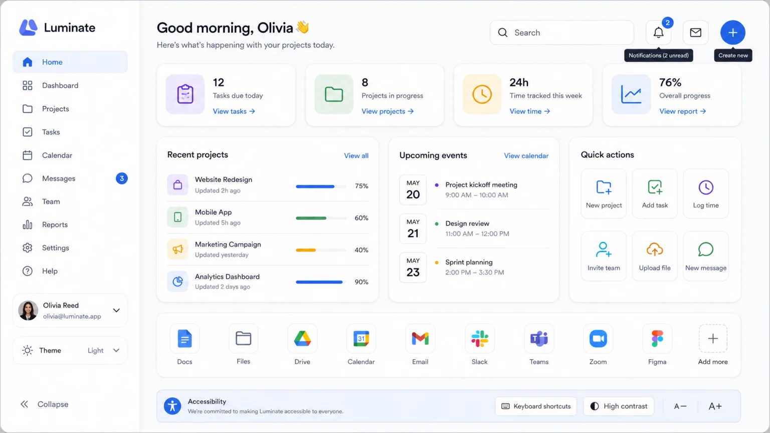
Imagine navigating a digital interface where every ‘save’ icon looks slightly different, or where the ‘settings’ gear changes its stroke weight from one screen to the next. Such visual inconsistencies can quickly disorient users, making an interface feel unreliable and difficult to learn. Icons, though small, are critical visual cues that must convey meaning instantly and reliably. When their appearance varies, users hesitate, their trust erodes, and the overall experience suffers.
The challenge isn’t just aesthetic; it’s about functionality and accessibility. A poorly managed icon collection can create barriers for users with visual impairments or cognitive differences, who rely on predictable visual language. This is where a well-structured icon library becomes indispensable. It’s not merely a folder of images, but a systematic approach to ensuring every icon serves its purpose clearly, consistently, and accessibly across all touchpoints.
Establishing Visual Consistency Through Shared Standards
Consistency in icon design is more than just a visual preference; it’s a cornerstone of usability. When icons share a unified visual language, users can quickly recognize patterns and understand functions. This consistency encompasses grid alignment, stroke weight, sizing, and color, all contributing to a cohesive user experience.
For example, a robust design system might mandate that all icons adhere to a 24×24 pixel grid, with a consistent 2px stroke weight. this helps that whether an icon represents a ‘home’ button or a ‘settings’ cog, it maintains visual harmony. Deviations, such as an icon with a 1px stroke next to one with a 3px stroke, introduce visual noise and disrupt the interface’s balance.
Color consistency is equally vital. Icons often use color to convey status or interactivity. A standard palette ensures that a ‘success’ icon always uses the designated green, and a ‘warning’ icon always uses the specified yellow. This predictable use of color reinforces meaning and reduces cognitive load for users, making interactions more intuitive.
Integrating Icon Libraries into Design Systems
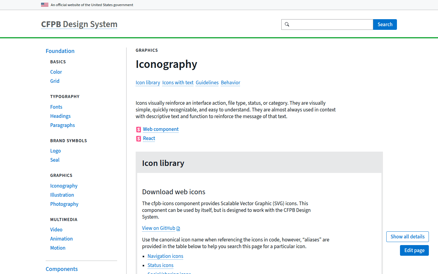
For scalable and maintainable UI design, icon libraries are most effective when integrated as components within a broader design system. This approach treats icons not as isolated graphics but as reusable elements with defined properties and behaviors. A design-system icon component, often built from SVG icons, allows for centralized management and easy distribution across projects. Another useful checkpoint is Iconography – CFPB Design System.
The W3C Design System, for instance, provides technical guidelines for SVG icons, recommending explicit width and height attributes. This practice ensures consistent sizing and prevents layout shifts when icons load. Furthermore, child elements within an SVG that are purely decorative should be hidden from assistive technology to avoid unnecessary clutter for screen reader users.
Integrating icons into a design system also streamlines updates. If a brand’s visual identity evolves, or a new icon style is adopted, changes can be made at the component level. These updates then propagate throughout all interfaces that use the system. This prevents the tedious and error-prone process of manually updating individual icon files across multiple platforms, saving significant time and effort.
Prioritizing Accessibility in Icon Design
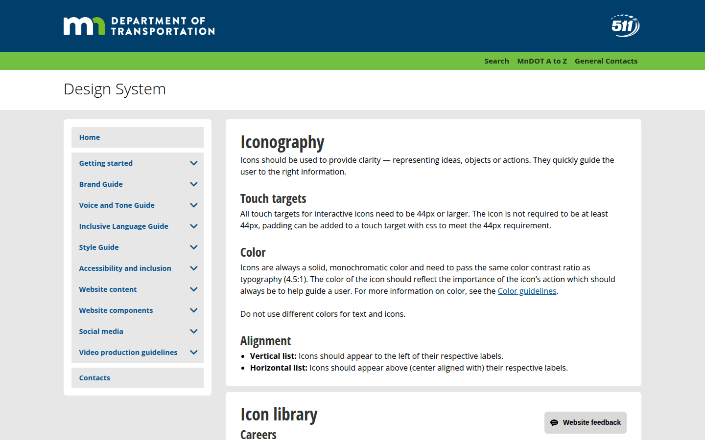
Icons must be accessible to all users, including those who rely on assistive technologies. This means carefully considering factors like touch target size, contrast, and semantic labeling. Interactive icons, such as those used for buttons or navigation, require specific attention to ensure they are usable by everyone.
For instance, interactive icons need touch targets of at least 44px by 44px to accommodate users with motor impairments or those interacting with touchscreens. This guideline, emphasized by systems like MnDOT, ensures that icons are easy to tap or click without accidental activation of adjacent elements. Additionally, icons should meet the same contrast expectations as typography, ensuring they are legible against their background for users with low vision. For a documented checkpoint, compare this step with Iconography – Design System – MnDOT.
Semantic labeling is crucial for icons that convey meaning without accompanying text. Atlassian’s guidance recommends pairing icons with meaningful text whenever possible. When an icon appears without a visible label, an aria-label attribute should be used to provide a descriptive text alternative for screen readers. It’s equally important to avoid duplicating accessible labels when text is already present, as this can create redundant and frustrating experiences for assistive technology users.
Structuring and Maintaining Your Icon Library
An effective icon library is not just a collection of files; it’s a structured system that supports ongoing maintenance and evolution. Proper organization ensures designers and developers can quickly find, understand, and implement the correct icons, reducing friction in the design and development workflow.
Consider organizing icons by category (e.g., navigation, actions, status), by style (e.g., outline, filled), or by component. A clear naming convention is also vital. For example, an icon representing a user profile might be named icon-user-profile.svg, while a notification bell could be icon-notification-bell.svg. This systematic naming facilitates search and integration, making the library more efficient to use.
Regular audits of the icon library are essential to identify and remove unused or deprecated icons, ensuring the library remains lean and relevant. As new features are added or design trends evolve, the library should be updated to reflect these changes, always adhering to the established visual and accessibility standards. This proactive maintenance prevents icon bloat and ensures the library continues to serve as a reliable resource for UI development, supporting long-term project health.
Implementing SVG Icons for Flexibility and Performance
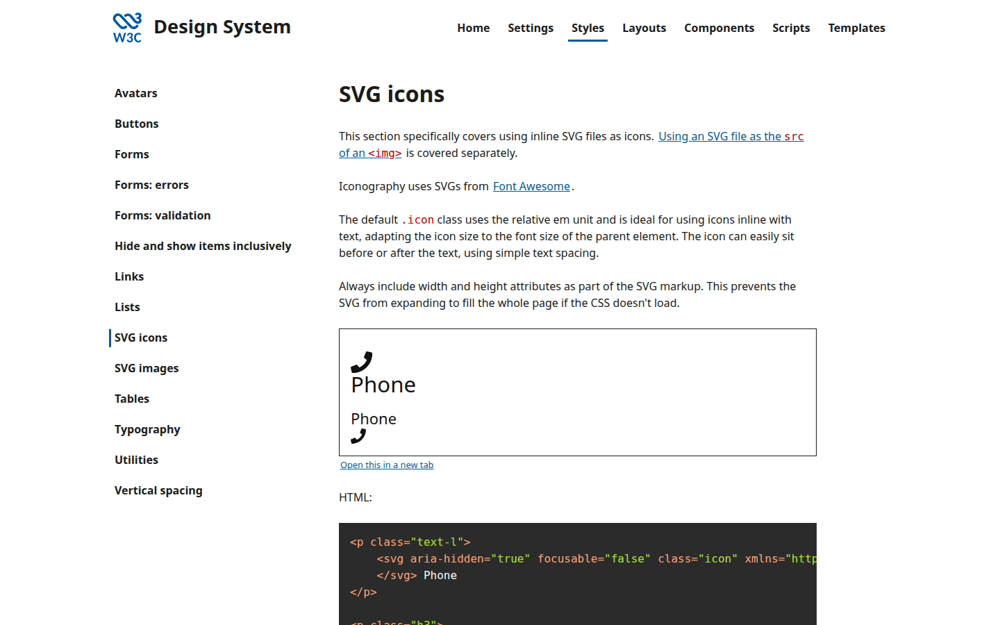
Scalable Vector Graphics (SVG) are the preferred format for UI icons due to their inherent flexibility and performance benefits. Unlike raster images, SVGs can scale to any size without losing clarity, making them ideal for responsive designs that adapt to various screen resolutions and pixel densities. this helps crisp, clear icons on all devices, from mobile phones to large desktop displays.
Beyond scalability, SVGs offer significant advantages in terms of customization. Their XML-based structure allows for easy manipulation of properties like color, stroke, and size directly through CSS or JavaScript. This means a single SVG icon can be adapted to different states (e.g., hover, active) or themes (e.g., light mode, dark mode) without needing separate image assets for each variation. This dynamic adaptability reduces file size and simplifies asset management, making development more efficient.
When implementing SVG icons, embedding them directly into the HTML or using an external SVG sprite are common practices. Direct embedding offers maximum control and allows for CSS styling, while SVG sprites can improve performance by reducing HTTP requests. Regardless of the method, ensuring proper semantic markup and accessibility attributes, as outlined by W3C guidelines, is paramount for a robust implementation that benefits all users.
Balancing Icon-Only and Text-Labeled Controls
A common design dilemma involves deciding when an icon can stand alone and when it requires a text label. While icon-only controls can save space and appear visually clean, they can also introduce ambiguity if the icon’s meaning isn’t universally understood. Ambiguity forces users to guess, slowing down their interaction and increasing the likelihood of errors, which can be particularly frustrating.
Consider a ‘share’ icon. While a common symbol, its exact meaning (share to social media, share via email, copy link) might not be immediately clear without a text label or contextual tooltip. Conversely, a ‘print’ icon, often depicted as a printer, is generally well-understood and might function effectively without a label in certain contexts, especially if it’s a secondary action.
The best practice, as suggested by Atlassian, is to pair icons with meaningful text whenever possible. This hybrid approach offers the benefits of visual recognition while ensuring clarity for all users, including those who are new to the interface or have cognitive differences. For situations where space is extremely limited, and an icon must stand alone, rigorous user testing is critical to confirm its universal comprehensibility. In these cases, providing an aria-label is not just a best practice but a necessity for accessibility, ensuring screen reader users receive the full context.
By carefully selecting, structuring, and implementing icon libraries, designers can ensure their interfaces are not only visually appealing but also consistently usable and accessible. This deliberate approach to iconography transforms small visual elements into powerful tools for guiding user interaction, ultimately creating a more intuitive and inclusive digital experience for everyone.
 Logo Template
 Logo Template
 Icon Template
 Logo Template