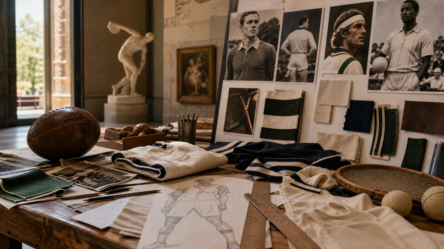
A crest gets recognized quickly. The harder job is making it carry enough feeling that fans keep returning to it over time.
That tension sat at the center of a sports branding discussion at Advertising Week New York, where executives from the Washington Commanders, Cleveland Cavaliers, WTA, and Gotham FC shared how fandom is built and kept. Their examples were concrete. Identity, memory, culture, and star power worked together in ways you could actually see.
For designers, that distinction matters. A logo opens the door, but attachment usually gathers around uniforms, objects, venues, appearances, and the public face of players. The brand starts to act less like a fixed stamp and more like a system with timing.
Recognition starts the relationship
Sports teams and leagues often get discussed as if visibility were the main task. Get the mark seen, repeat the colors, push the merchandise. That still matters, but it misses what keeps fans close across years.
The stronger move is to give people more than a graphic to remember. Fans hold onto the thing they wore during a winning era, the player appearance that made a club feel present in culture, or the event setting that changed the tone of a tournament. These are branding moves because they shape meaning, not just exposure.
That helps explain why sports identity behaves differently from many corporate systems. It is less about polishing every edge and more about creating a recognizable signature that can absorb emotion without losing clarity.
Nostalgia needs visible detail
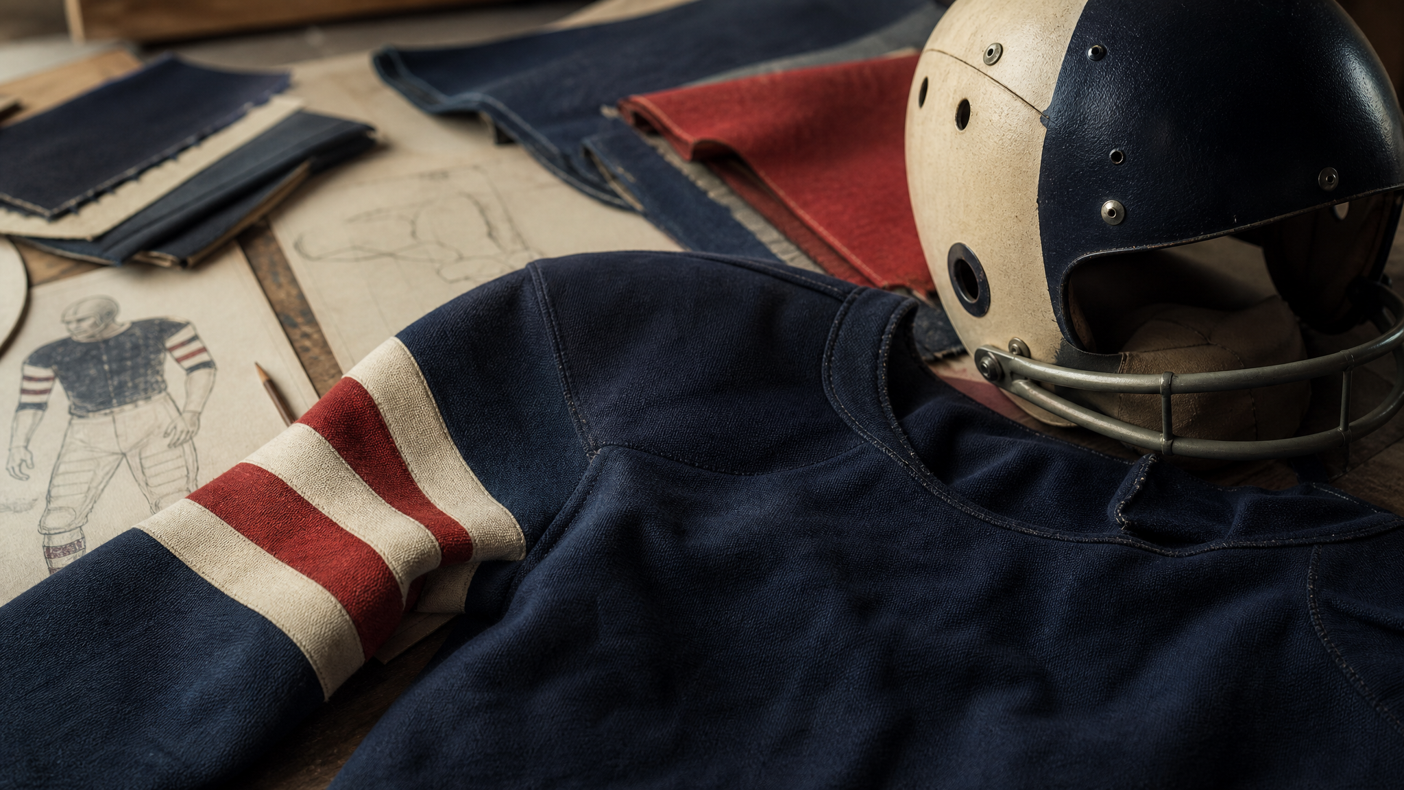
The Washington Commanders offered one of the clearest examples by bringing back Super Bowl-era uniforms worn in the 1980s and 1990s. That is not a minor styling tweak. It is a visual return to a period many fans already associate with pride, continuity, and shared memory.
Designers sometimes treat nostalgia as soft or abstract, but in sports it becomes physical. It shows up in striping, color balance, fabric cues, helmet details, and silhouette. Those choices give supporters something exact to recognize, which is why a revival can land harder than a new campaign line.
Used well, nostalgia does not trap a brand in the past. It gives the present a stronger outline. The old uniform becomes a bridge between current performance and inherited meaning.
This same logic shows up in other identity systems too. Brisbane 2032 builds two emblems from one disciplined outline because familiar form can hold multiple stories when the structure is strong enough.
Artifacts hold more than merchandise can
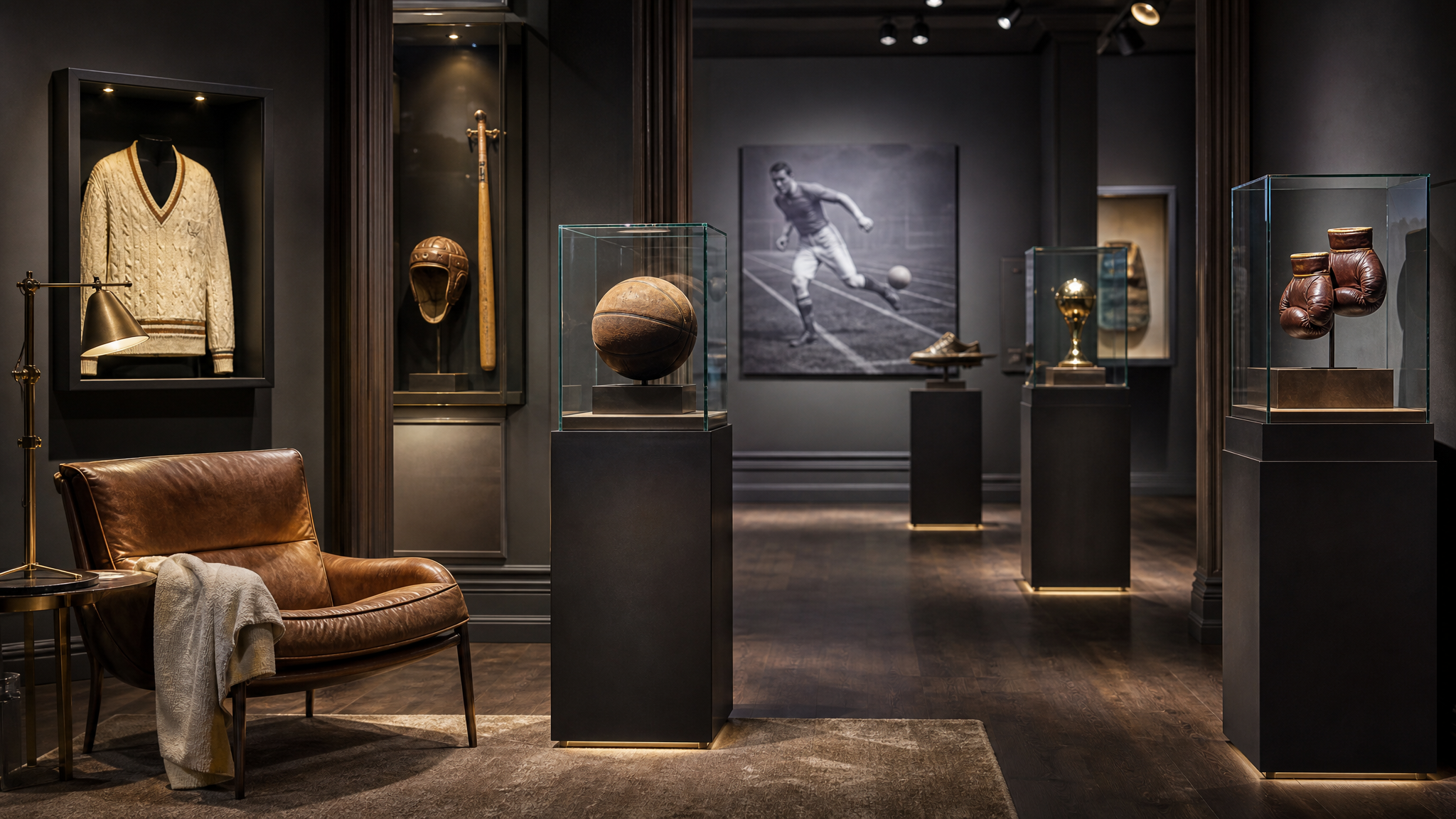
The Cleveland Cavaliers pointed to one-off memorabilia, including a towel used by James Harden in his first game and a chair occupied by Taylor Swift. These items are unusual, even slightly odd, and that is part of their strength.
They turn brand value into artifact value. The team is no longer selling only an officially branded product. It is framing a moment, giving it edges, and letting fans own a piece of the event.
From a visual strategy standpoint, this expands the brand beyond approved assets. The important move is not adding more logos to more surfaces. It is deciding which moments deserve preservation, then presenting them with enough care that they feel collectible rather than incidental.
That idea connects neatly with continuous brand presence. When a brand learns to capture meaning between major announcements, the relationship with the audience becomes steadier and richer.
Context can reposition the league
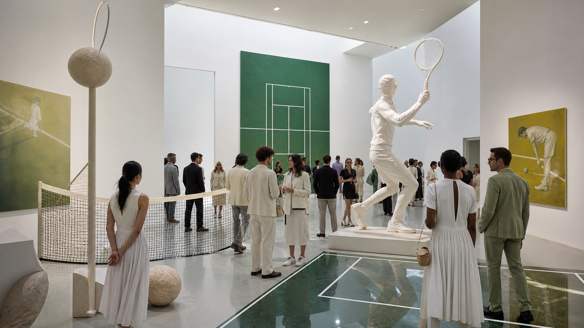
The WTA went through a significant rebrand to position itself more prominently in entertainment, fashion, and pop culture. That is a positioning shift, but it is also a visual one. The places a brand chooses to appear help define what kind of world it belongs to.
Staging its Miami tournament at an art museum is a sharp example. The venue changes the frame around the sport. It suggests that tennis can sit comfortably beside art, style, and cultural conversation rather than staying inside a sealed athletic lane.
Context is read quickly. A museum setting communicates curation, taste, and intention before a single match begins. The brand gains a different direction without abandoning the sport at its core.
For teams or leagues trying to broaden appeal, the practical lesson is clear: do not stop at the symbol. Reconsider the backdrop, the guest list, the camera angles, and the social surfaces where the brand appears.
Player presence gives the club its face
Gotham FC emphasized player visibility in pop culture, including appearances on Late Night with Seth Meyers and at the U.S. Open. That choice treats players as brand carriers, not just roster names.
There is a design implication here that often gets missed. If players are central to the club story, the identity system has to leave room for portraiture, personality, and editorial framing. The club mark cannot do all the work by itself.
Good sports branding gives star talent a place inside the system without letting the whole structure collapse into celebrity borrowing. That balance is delicate. Too little player presence and the brand feels distant. Too much, and the club starts to depend on temporary fame instead of durable meaning.
Gotham FC’s approach suggests a steadier model: lift the players, let them move through culture, and use those appearances to tell the story of the club. The result is not just promotion. It is narrative architecture.
Moments need a system behind them
One of the strongest themes in the discussion was the need to meet fans at the moment. The phrase can sound vague until the examples are set side by side.
A retro uniform meets a fan in memory. A one-off object meets a fan in possession. A museum tournament meets a fan in cultural aspiration. A player appearance on late-night television meets a fan in everyday media life.
Each move reaches people in a different emotional state, but all of them share one principle: the brand adjusts its expression without losing identity. That is less about constant reinvention than about careful choreography across touchpoints.
If the system is weak, these moves feel scattered. If the system is strong, they feel like variations on a theme. That is where brand structure quietly proves its worth.
Lasting fandom is built as a visual system
Sports brands that last do not rely on one master asset. They build a family of cues that can carry history, context, and personality over time. Uniforms, memorabilia, venue choices, and player appearances all become part of the same language.
For creative teams, that means storing and organizing more than logos and wordmarks. It helps to maintain references for heritage looks, photography approaches, event environments, and campaign-ready player assets. A clear library makes it easier to keep those elements aligned as new moments arise, which is exactly where a scalable brand asset library workflow earns its keep.
When those assets need motion for social clips or match-day reveals, a focused tool such as animated logos for social media can help extend the identity without changing its character.
The larger lesson is simple. Fans stay when the brand keeps giving them specific things to feel, remember, and recognize. The crest may start the relationship, but lived moments are what make it last.
 Logo Template
 Photo Template
 Logo Template
 Logo Template