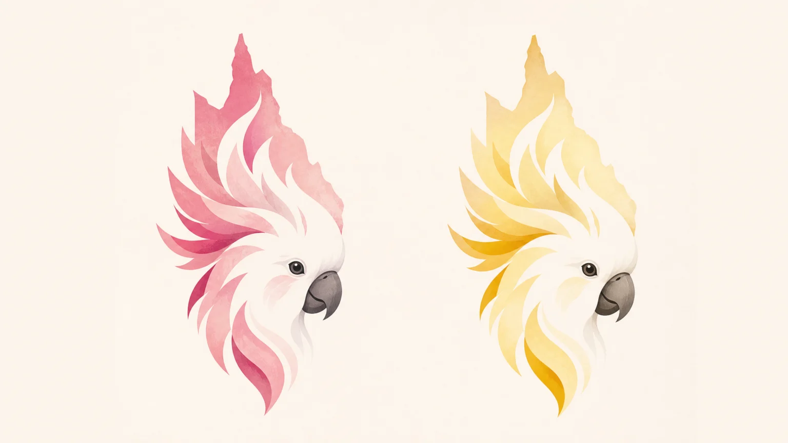
A shared outline can do a surprising amount of work when every detail is controlled. The Brisbane 2032 Olympic and Paralympic emblems use one clear silhouette to hold two identities, then deepen that structure with references to place, culture, and the year of the Games.
These newly unveiled emblems belong to a broader identity system for a major global event, not a one-off logo reveal. The logos and their bespoke font were designed by a consortium of local and global creative agencies, overseen by the Brisbane 2032 Organising Committee, and extensively tested in Australia and internationally. That process matters at this scale because the marks have to perform across cultures, formats, and viewing distances.
Shared silhouette, separate identities
The Olympic and Paralympic emblems keep the same general shape, then split through color and bird reference. The Olympic logo represents the pink cockatoo, while the Paralympic logo represents the sulphur-crested cockatoo. That choice keeps the family resemblance strong without asking the audience to decode two entirely different forms.
This is where many identity systems either tighten up or come apart. If related marks drift too far, the system loses its center. If they sit too close, distinction starts to blur. Brisbane 2032 treats form as the anchor and color as the separator, which gives the pair a clean visual rhythm.
The result is a system-minded approach rather than a single-badge solution. Event brands get stronger when they stop acting like signage for exactly this reason: the structure has to carry across uses, not just survive a first impression.
Queensland and flame references inside the form
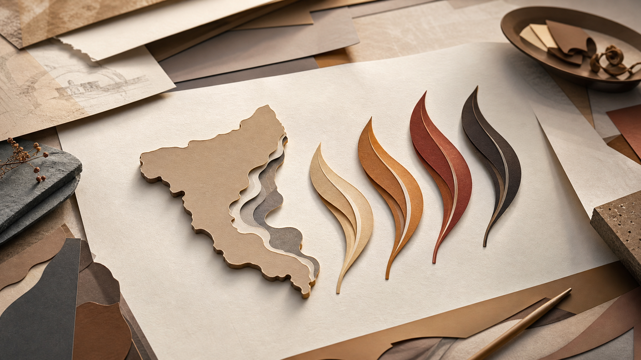
The bird reference is only the first layer. The cockatoo crests mimic the shape of Queensland, tying the emblems to place without dropping a literal map into the center of the design. It is a measured decision, and it keeps geography inside the silhouette instead of beside it.
The feathers add another level of meaning. They are shaped like the Olympic and Paralympic flames to represent unity, hope and inspiration. That kind of mapping can easily feel overpacked, but here the parts stay closely related enough to read as one idea.
There is a practical lesson in that restraint. A crest, flame-like feather shapes, and a stable outline are enough to give the mark direction while keeping it readable at small sizes.
Five feathers that quietly mark the year
One of the sharpest decisions in the emblems is easy to miss at first glance. The five feathers are arranged with three on the left and two on the right, a subtle nod to the year of the Games. The emblem works without that knowledge, which is exactly why the detail succeeds.
Clarity comes first. Discovery comes second. When hidden meaning supports the composition instead of interrupting it, symbolism feels earned rather than decorative.
That distinction matters in large identity programs. The audience should never have to solve the mark before it becomes legible. Here, the feather count behaves like internal structure, not trivia.
Cultural meaning shapes the central idea
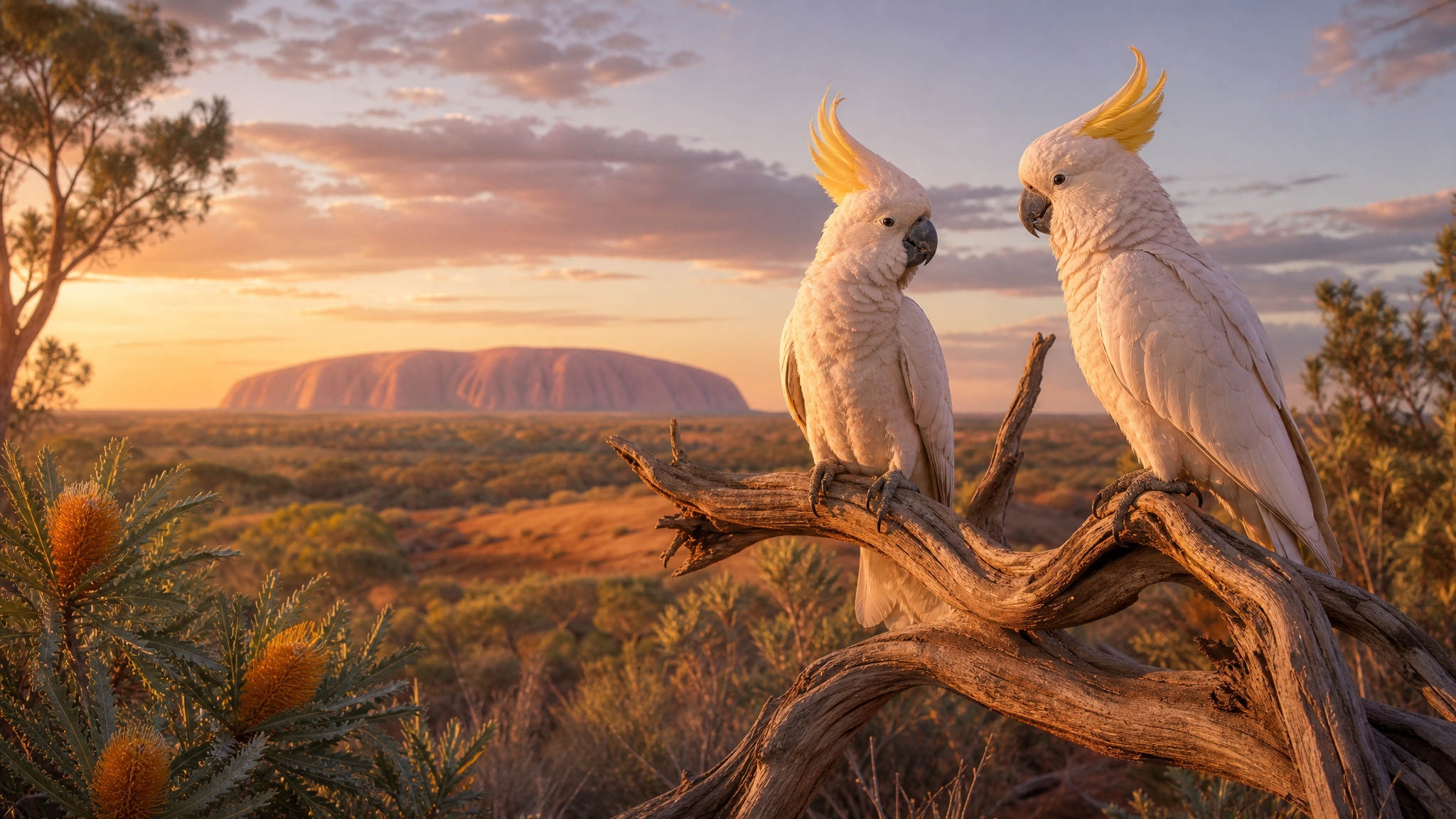
The cockatoos carry First Nations significance, with strong connections to Country and a cultural role as messengers linking people to place, story and ceremony. That changes the reading of the emblems. The birds are not just local fauna selected for novelty or color.
In visual identity, cultural context is strongest when it shapes the main idea rather than arriving as surface decoration. Here, the bird is not an accessory around the logo. It is the logo.
That is also why place feels convincing in the work. A civic logo works harder when place does the talking because viewers can tell when local meaning is built into the form itself.
Testing gives symbolism room to travel
The logos and bespoke typeface were extensively tested in Australia and internationally. For an event identity, that practical step carries as much weight as the concept. A mark can hold rich local meaning and still fail if it loses clarity across languages, screens, merchandise, or broadcast conditions.
Testing answers the difficult questions early. Does the shared shape stay distinct in different colorways? Do the feather forms reproduce clearly at small sizes? Does the custom type support the same tone as the emblem? Good systems are rarely just drawn well. They are tested well too.
That same discipline helps at smaller scales. When variants, files, and usage rules stay organized, quality becomes easier to protect, which is why a scalable brand asset library workflow belongs to the design conversation, not just the operational one.
Motion should follow the emblem’s own logic
If these emblems move on screen, the best animation would come from the structure already present in the drawing. The crest shape, the five-feather arrangement, and the contrast between shared form and different colorways already offer enough cues for timing and reveal. A careful treatment would let those parts appear in sequence and keep the mark’s calm authority intact.
That is usually the right instinct with symbolic logos. Let movement clarify what the drawing already knows. Heavy effects would compete with details the emblem has already resolved on the page. In systems like this, tools such as logo reveal animation or seamless logo loops work best when they respect the mark’s structure.
One outline, many meanings
The Brisbane 2032 emblems show how much one silhouette can carry when each element earns its place. The same structure supports Olympic and Paralympic identities. Color separates them. Crest and feather forms connect them to Queensland, flames, and the year of the Games. The cockatoos bring First Nations significance that ties the marks to Country, story, and ceremony.
That layered construction gives the system staying power. It reads quickly, then offers more on return. For identity designers, that balance is always worth studying.
 Photo Template
 Icon Template
 Photo Template
 Logo Template