

Why Brand Consistency Matters for Ad Conversion
Imagine scrolling through your social feed and seeing an ad that catches your eye. You click, interested, but the landing page looks completely different from the ad. The colors are off, the font is unfamiliar, and the message feels disjointed. This immediate visual disconnect creates friction, making you question the brand’s credibility and often leading you to bounce. This common scenario highlights why maintaining brand consistency in social media ads isn’t just about aesthetics; it’s about building trust and guiding users smoothly toward conversion.
Many brands struggle to balance the need for eye-catching social media ads with the strictures of their established brand guidelines. The temptation to create something entirely new to stand out can lead to ads that perform well in isolation but dilute the overall brand message. An ad might grab attention, but if it doesn’t immediately connect to the brand’s established identity, that attention is wasted. Effective ad creative should align directly with brand identity, using strong headlines and making the next step obvious. This means every visual element, from logo placement to color choices, must reinforce who you are. Brand guidelines, which typically define logo usage, color palettes, typography, and imagery rules, are not obstacles; they are the framework that ensures content consistency across all channels, including social media ads.
Step 1: Define Your Ad’s Conversion Goal and Audience
Before any design work begins, clearly define what you want your social media ad to achieve. Is it to drive website traffic, generate leads, increase app downloads, or boost sales for a specific product? A clearly defined goal is foundational for effective social media advertising. Once the goal is set, consider your target audience. What are their pain points, interests, and how do they typically interact with content on the specific social platform you’re targeting?
Understanding your audience helps tailor both the visual and textual elements of your ad. For instance, an ad targeting young professionals on LinkedIn might use a more subdued color palette and professional imagery, while an ad for a consumer product on Instagram could leverage vibrant visuals and a more casual tone. This initial clarity ensures that every design decision supports the ultimate conversion objective and resonates with the intended viewer. Without a clear goal and audience in mind, even the most visually appealing ad can fall flat, failing to convert because it lacks direction and relevance.
Step 2: Prioritize Mobile-First Visuals and Legibility
The vast majority of social media users access platforms via mobile devices. This means your ad must be designed with small screens and quick consumption in mind. High-performing social ads are easier to scan when text is legible on small screens and the ad is designed specifically for mobile users. This isn’t just about shrinking a desktop ad; it’s about optimizing every element for a mobile context.
Consider the visual hierarchy. What is the most important element? It should be immediately apparent, even at a glance. Use eye-catching visuals or video, with concise messaging and a clear call to action (CTA). For example, a product image should be clear and well-lit, not cluttered with too many details. Text overlays should be minimal, large enough to read without zooming, and contrast sharply with the background. Avoid intricate patterns or small fonts that become illegible on a phone screen. Think about how a user scrolling quickly will perceive your ad: does it convey its core message in a fraction of a second?
When designing for mobile, remember that attention spans are short. A complex graphic might work in a print magazine, but on a mobile feed, simplicity and immediate impact are key. This often means focusing on a single, compelling visual and a very brief headline. Mailchimp, for example, stresses the importance of mobile-first design for social ads, recognizing that a cluttered ad simply gets scrolled past. Prioritizing mobile ensures your message cuts through the noise, reaching users where they spend most of their time.
Step 3: Integrate Brand Guidelines Seamlessly
Brand guidelines are your roadmap to visual consistency, not a creative straitjacket. They ensure that every ad, regardless of platform or campaign, feels like it comes from the same source. This consistency builds recognition and trust over time. Your guidelines should cover specific aspects like logo placement and size, approved color palettes, typography, and imagery styles.
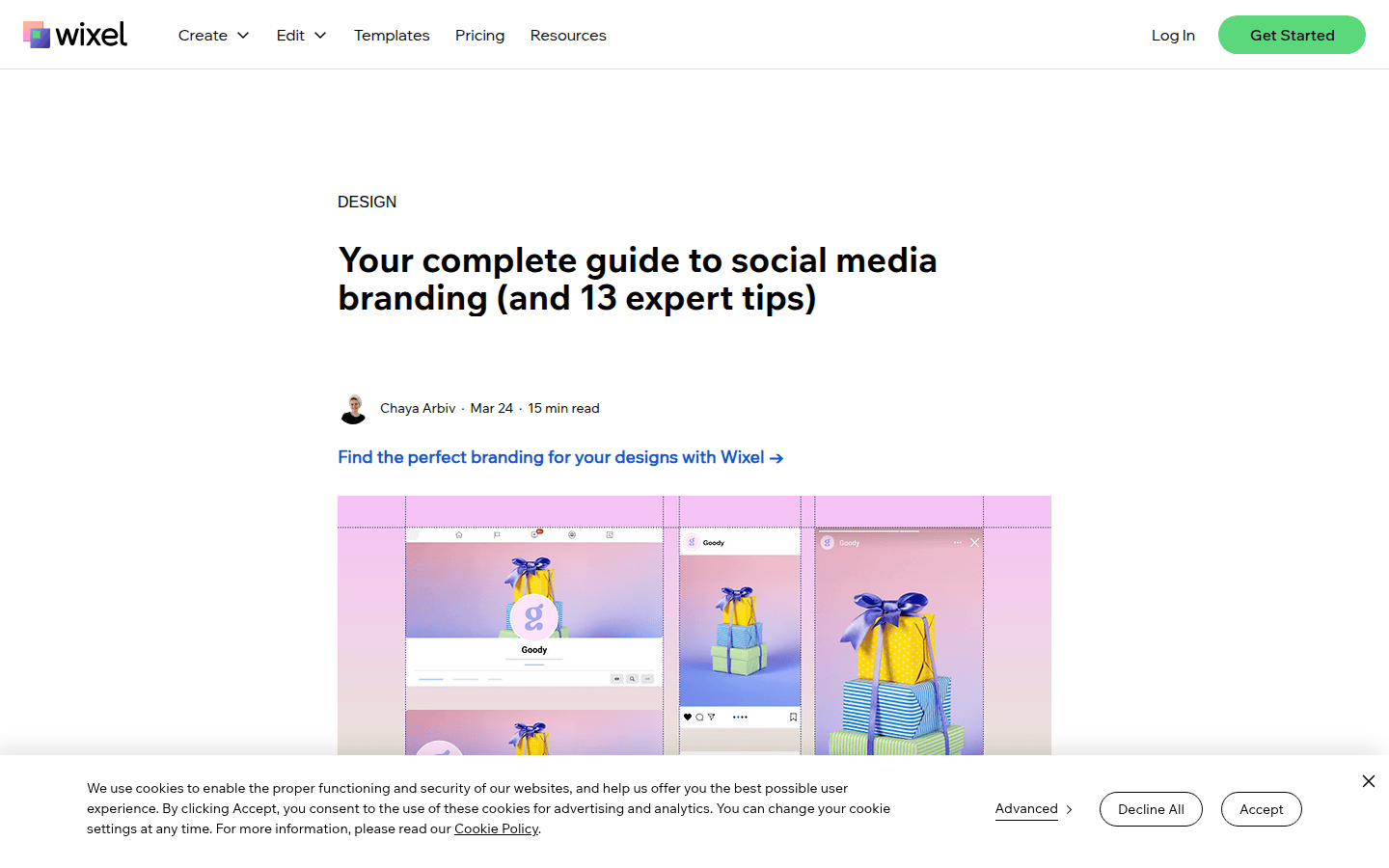
For instance, if your brand uses a specific shade of blue and a sans-serif font for headlines, these elements must be present and correctly applied in your social ad. Avoid introducing new fonts or off-brand colors just to make an ad "pop." Instead, use the established elements creatively. A strong brand identity, consistently applied, makes your ads instantly recognizable, even before a user reads the text. Wix provides a comprehensive guide on maintaining brand consistency across social media, emphasizing the importance of these foundational elements.
Consider how your logo appears. It should be visible but not dominate the ad, acting as a signature rather than the main attraction. The goal is to weave brand elements into the ad’s core design so they feel natural and integrated, rather than tacked on. This subtle reinforcement helps build long-term brand memory and affinity. Consistent branding across all touchpoints, including social ads, reinforces your identity and makes your marketing efforts more cohesive and memorable. You can find more detailed guidance on maintaining brand consistency in visual assets by exploring resources like A 5-Step Workflow for Global Brand Asset Consistency.
Step 4: Craft Concise, Action-Oriented Messaging
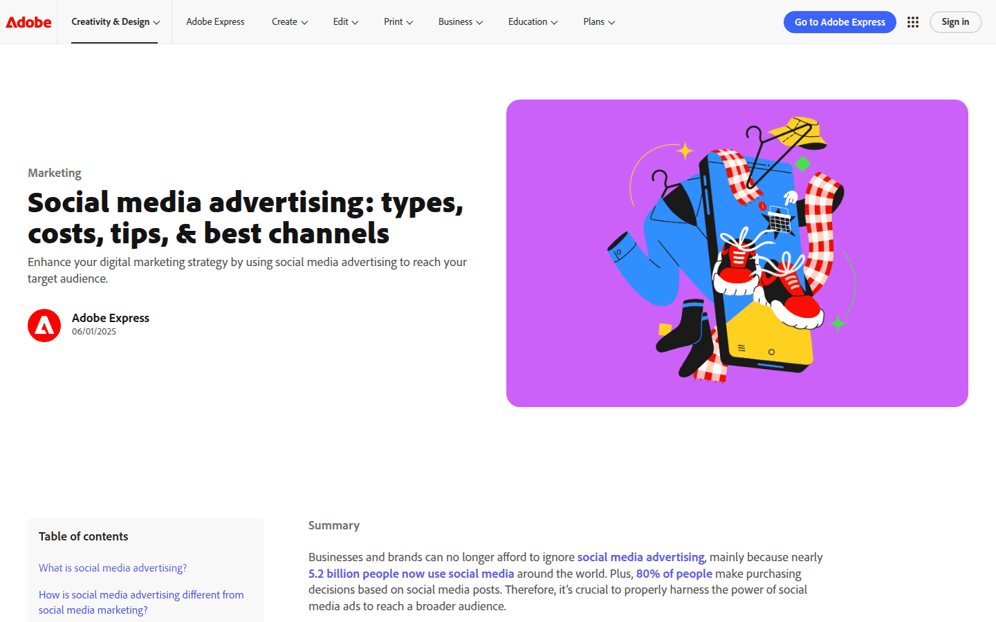
Social media users are often scanning, not reading. Your ad copy needs to be direct, benefit-driven, and brief. Conversion-focused social ads should use concise messaging and a clear call to action (CTA). This means getting straight to the point and telling the user exactly what you want them to do next. Another useful checkpoint is Social media advertising: Ads, cost & strategies – Marketing.
One message per ad is a common approach. Avoid trying to communicate too many benefits or offers in a single creative. Focus on the most compelling reason for the user to click. For example, instead of "Our new software has features A, B, and C, and it’s on sale," try "Boost your productivity by 30%. Try our software free." The latter is clear, highlights a key benefit, and provides a direct next step.
The call to action itself should be prominent and unambiguous. Phrases like "Shop Now," "Learn More," "Sign Up," or "Download" work best. Place the CTA strategically, often as a button, ensuring it stands out visually. Cropink emphasizes brand alignment and clear CTAs in ad design, highlighting their role in guiding user behavior. Clear, compelling messaging paired with a strong CTA is the engine of conversion, turning interest into action.
Step 5: Design a Cohesive Landing Page Experience
The ad itself is only the first step in the conversion journey. The landing page is where the conversion actually happens, so it must be a seamless extension of the ad. A fast, mobile-friendly landing page that matches the ad’s message can significantly improve the conversion flow. If a user clicks an ad expecting one thing and lands on a page that looks completely different or talks about something else, they are likely to bounce.
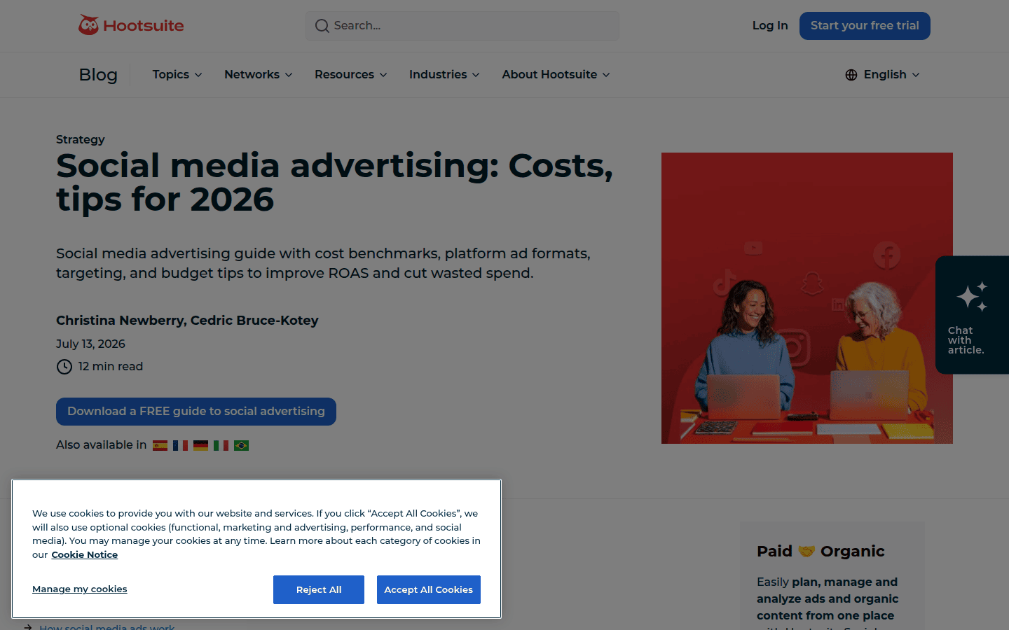
Ensure the landing page carries over the same visual branding, messaging, and offer presented in the ad. For example, if your ad promises a "20% off all summer dresses," the landing page should immediately display summer dresses with the discount clearly visible, not a generic homepage. Hootsuite highlights the importance of landing page alignment with ad content, stressing that consistency builds trust and reduces friction.
The landing page should also be optimized for speed and mobile responsiveness. Slow loading times or a difficult-to-navigate mobile experience will deter even the most interested users. Test your landing page on various devices to ensure a smooth, intuitive experience from ad click to conversion. A well-designed landing page completes the user journey, fulfilling the promise of your ad and converting interest into tangible results. For more insights on optimizing your ad campaigns, consider exploring resources like Magier’s Ad Design Best Practices.
Step 6: Test, Analyze, and Iterate
Designing effective social media ads is an ongoing process of refinement. What works for one campaign or audience might not work for another. It’s crucial to test different elements of your ads, analyze the performance data, and iterate based on your findings. This iterative approach allows you to continuously improve conversion rates while staying within brand guidelines.
A/B testing is a powerful tool here. Test different visuals, headlines, CTAs, and even landing page variations. For example, you might test two versions of an ad: one with a static image and another with a short video, both adhering to brand guidelines. Or, test two different headlines that convey the same core message but with slightly different wording. Mailchimp’s resources on A/B testing social ads underscore its value in optimizing campaigns.
Pay attention to metrics like click-through rate (CTR), conversion rate, and cost per conversion. These numbers will tell you which ad elements resonate most with your audience. Don’t be afraid to make small, incremental changes and measure their impact. Even minor adjustments to visual hierarchy or CTA placement can lead to significant improvements over time. The University of Rhode Island’s best practices guide emphasizes a clearly defined goal, relevant visuals, short offer descriptions, one call to action, and a relevant landing page as essential elements for effective social media ads. Continuous testing and iteration are key to unlocking the full potential of your social media advertising efforts.
 Photo Template
 Icon Template
 Photo Template
 Photo Template