Most design systems lose people before the work even starts. The first few minutes ask for expert habits, the blank scene stays blank, and the user leaves before anything feels like a place.
The more interesting choice is to remove that early friction without trimming away the depth that gives advanced work its character. That balance sits at the center of this build toolset: easier entry, intact complexity, and more ways to shape an environment that still reads as personally authored.
Accessibility should remove setup pain, not creative control
The core idea is straightforward: keep the ceiling high, but lower the floor. Experienced builders still get the complexity they rely on, while newer players can reach a satisfying result sooner.
We want to keep a high ceiling… But we want to drop the floor a little bit to make things easier for most players to come in and build.
That distinction matters in any creative tool. You can simplify by cutting capability, or you can simplify the path into capability. The second option tends to last longer because it respects how people grow into a system.
That same tension appears in AI is speeding up local design work, but the finish still depends on the designer. Speed helps, but judgment still shapes the finish. Tools earn trust when they reduce labor without choosing the look for you.
Stamped forms give users momentum
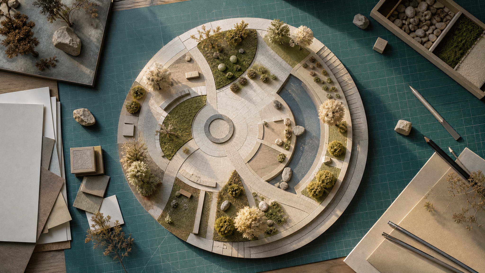
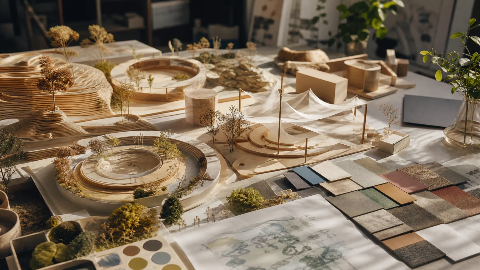
One of the clearest additions is a revamped path tool that lets players stamp down circular plazas. That may sound small, but foundational geometry is exactly where many new builders stall. If the ground plan takes too long, they never reach the expressive part.
A stamped plaza creates structure immediately. In one move, it establishes proportion, circulation, and direction, so attention can shift to atmosphere sooner. That is practical interface design: remove repetitive construction early, then leave room for adjustment after the base shape is in place.
Features like this often look easy because they hide friction well. Good defaults are quiet, but they do serious work. They help a blank scene become a place.
Flexible color and scale make authorship visible
The toolset also includes a flexi-colour system and scalable scenery. Together, they solve a problem many creative platforms never quite address: how to create variation without requiring entirely custom asset production.
Color quickly establishes visual signature. Scale quickly changes hierarchy. When both can shift, the same object can support several visual themes instead of locking every environment into one surface identity.
That matters because environment design rarely depends on one hero object. It depends on groups of objects agreeing with one another. If builders can tune scenery to match a visual theme, they can create parks with different architectural identities instead of repeating familiar pieces in slightly altered arrangements.
A similar principle runs through Why architectural thinking gives illustration its backbone. Strong systems organize relationships, not just parts. That is where flexibility starts to feel genuinely useful.
Open-plan buildings shift attention from objects to spaces
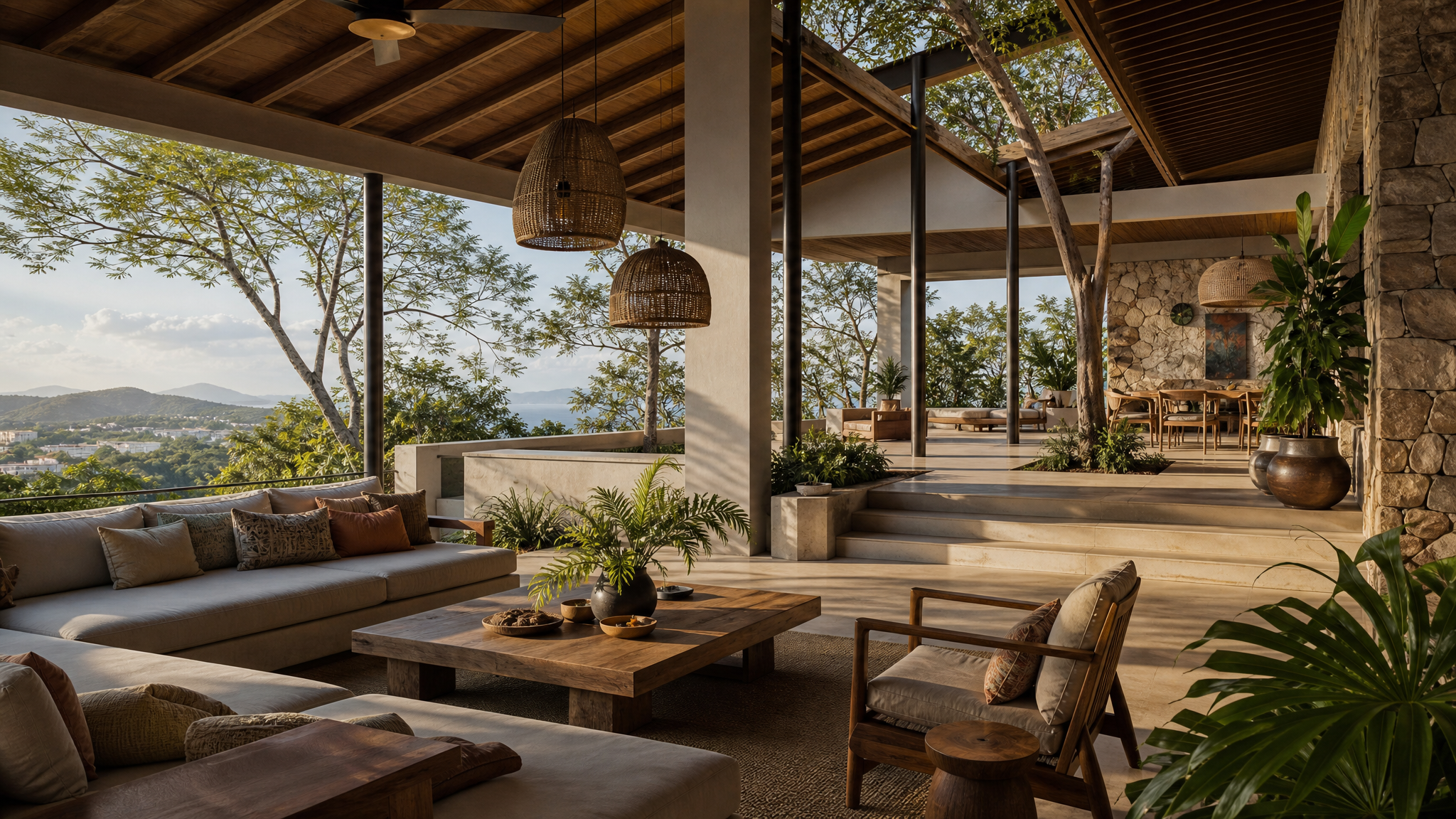
Open-plan buildings are especially revealing because they move the task away from placing closed shells and toward shaping space. Instead of treating a building as a sealed object, the system asks users to think about edges, shelter, visibility, and use.
That makes room for spaces such as cabana-style dining terraces, where airflow, partial enclosure, and sightlines matter more than a simple box with a roof. It is closer to how people actually read built environments. We notice thresholds, corners, overhangs, and how one area leads into the next.
This is a useful reminder for designers. Accessibility does not have to mean shallower thinking. Sometimes it means offering tools that match the real design problem more directly.
Terrain, foliage, and elevation build identity quickly
Upgraded foliage and terrain brushes add another layer of control that is easy to underrate. Plants and ground shaping are not decorative extras. They set mood, frame paths, soften transitions, and create depth before any individual prop takes focus.
The mention of different elevation layers matters just as much. Flat environments read quickly and fade quickly. Changes in height guide the eye, build anticipation, and help one zone feel distinct from the next without leaning on clutter.
For anyone shaping a visual world, the lesson is practical: identity often comes from landform and planting as much as architecture. A coherent environment usually starts with massing, then moves into detail.
Mid-build access to shared assets respects flow
Workshop integration directly in build menus is less showy than a rendering upgrade, but it may be one of the smartest usability choices here. Mid-build access means users do not have to stop, leave the task, search elsewhere, and then rebuild the idea from memory.
That interruption is where many tools quietly lose people. A platform can offer endless content and still feel awkward if the handoff points break concentration. Keeping shared assets inside the build process preserves momentum and makes community contribution feel native rather than attached later.
There is a broader point here. Accessible tools are often less about simplification than about reducing context switches. When the system keeps the user in the same mental space, the work feels lighter without feeling thinner.
Simulation-aware construction makes spectacle believable
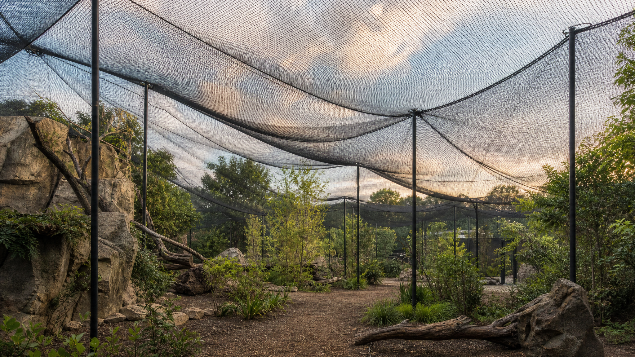
The more advanced construction features show how depth survives after entry becomes easier. Aviaries use support poles and physics-simulated net canopies, with netting that physically drapes between attachment points. Aquariums include full-depth glass viewing panels and underwater observation tunnels.
These details matter because complexity is serving visual credibility. The point is not technical novelty on its own. Construction behaves more like material behavior, which gives the finished environment weight and logic.
A canopy that drapes between attachment points reads differently from a flat shortcut because it carries the small irregularities people expect from real structures. That is where high-ceiling systems prove themselves: broad layout moves remain available, but there is still plenty to master once users are inside.
Lighting ties the environment together
A new global illumination system rounds out the set. Lighting is often the difference between a pile of objects and a place with atmosphere. It connects surfaces, reveals depth, and helps materials belong to the same world.
For aquariums, that effect becomes especially visible: glass, water, tunnels, reflections, and shadow all depend on believable interaction. But the larger lesson travels well. If the light is wrong, every other visual decision has to work harder.
That overlap helps explain why environmental design and motion tools often share the same visual logic. Depth Map Parallax and Photo Parallax Effects depend on a similar truth: depth feels convincing when layers, light, and spatial relationships agree.
What this toolset gets right
The most convincing part of this system is its restraint. It does not confuse accessibility with reduction. Stamped plazas, open-plan buildings, flexible color, scalable scenery, upgraded terrain and foliage tools, integrated shared assets, simulation-aware structures, and stronger lighting all push in the same direction.
- Early steps become easier through ready-made structural actions such as stamped layouts.
- Authorship stays visible through control over color, scale, theme, and spatial identity.
- Advanced work keeps its depth through simulation-driven structures and more credible environmental behavior.
- Creative flow improves when external assets are available inside the build process.
That combination is rare because it requires discipline. The goal is not simply to add features. The goal is to create better entry points into meaningful choices.
When a creative system works, people feel capable earlier and expressive for longer. That is a better standard than simplicity by itself.
 Logo Template
 Photo Template
 Photo Template
 Photo Template