
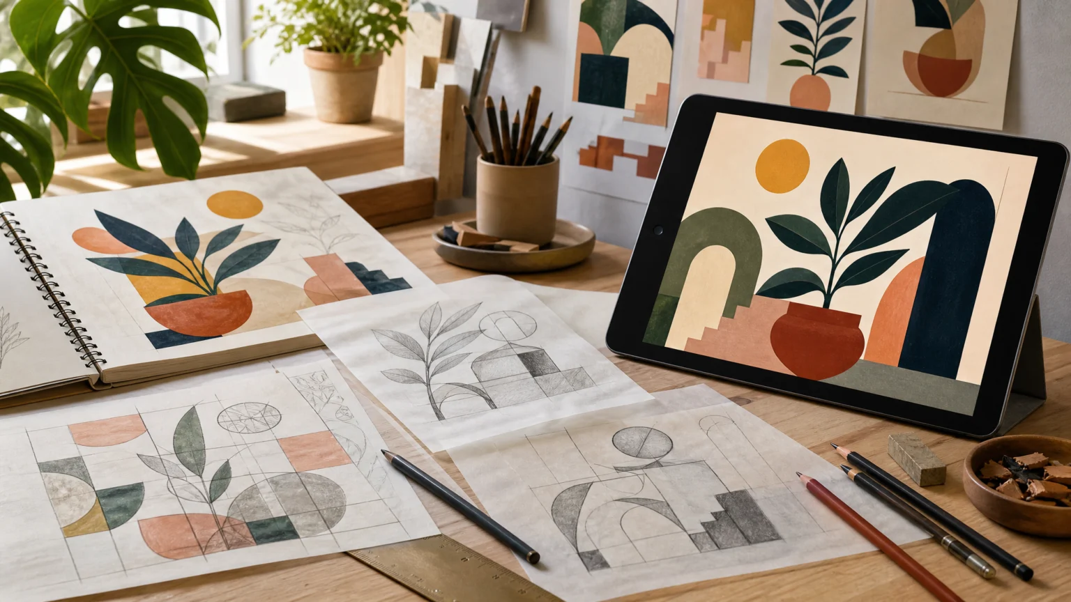
Some illustrations feel steady before you can explain why. The color may arrive first and the shapes may look playful, even surreal, but the image holds because the structure underneath is doing real work.
That tension is where a lot of memorable illustration lives. Surface appeal draws the eye in; proportion, spacing, and construction keep the piece from falling into decoration.
When drawing starts with foundations
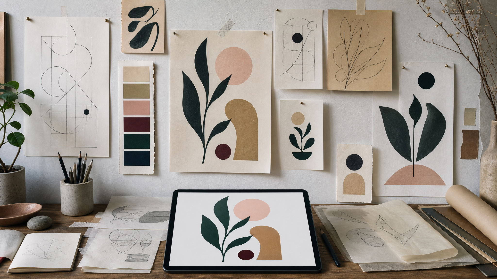
An illustrator with architectural training brings a particular habit of mind to the page. Proportion gets measured, space gets read carefully, and each element is tested against the others, so even a simplified image feels anchored rather than arbitrary.
You can see that clearly in work that is flat, bold, and slightly surreal while still ruled by internal order. The forms are stylized, but they do not drift. They connect with intention, and that gives the composition direction without making it rigid.
For designers and illustrators, the practical lesson is simple: make the load-bearing choices first. Before texture, effects, or polish, establish the underlying system. A strong image often begins the way a building does, with foundations.
Why structure makes bold work feel calm
Flat color and pared-down shapes can lose their force when they exist only as visual flair. Structure changes that. It sets hierarchy, controls spacing, and defines relationships that let the eye move across the page with confidence.
This is one reason some images feel immediate at first glance and richer on a second pass. The surface is accessible, but the composition has been carefully arranged. Negative space carries weight, edges align on purpose, and visual mass is distributed so the whole picture feels stable.
That same principle shows up in identity work. We explored a related issue in When three logo options feel like one: variation without structural change rarely creates real distinction. In illustration, the reverse also holds. When the underlying build is clear, even a restrained visual vocabulary can leave a lasting impression.
Structure often appears long before the final color pass.
Editorial covers are closer to objects than pictures
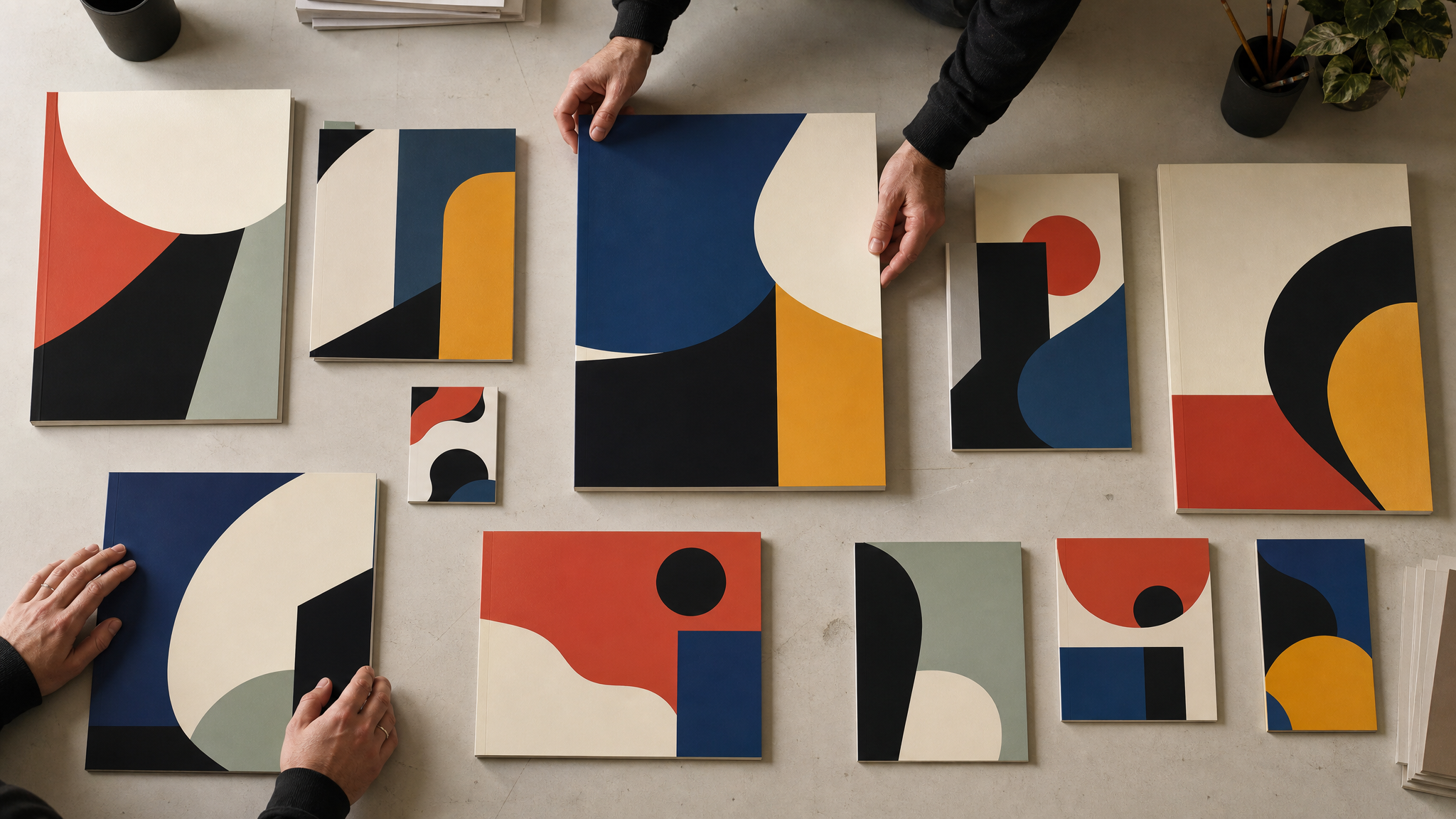
Cover illustration asks for a different kind of compositional intelligence. It is not enough to make a compelling image inside a rectangle. The piece has to read at several sizes, catch attention in a crowded setting, and still hold together as a complete form.
That is why cover-making can feel closer to designing an object than composing a picture. A cover has to work in several contexts at once. It meets borders, neighboring content, and a viewer’s split-second attention, so each shape, contrast decision, and focal point has to carry more weight.
Architectural thinking is especially useful here. It keeps containment, outer presence, and internal order in view at the same time. A cover cannot depend on one clever detail; it needs a clear signature from across the room and enough thought in the composition to reward a closer look.
A similar constraint appears in identity systems when recognition remains intact but usefulness starts to narrow. When a logo is recognizable but too narrow examines that tension. Covers face their own version of it: they need to stay vivid while adapting to scale, context, and surrounding noise.
Personal projects are where visual language gets tested
Professional assignments sharpen craft, but personal work often reveals the deeper system behind an artist’s choices. An ongoing project centered on invented plants shows how that kind of visual research works. The subject stays open, but the method remains disciplined: invent forms, set rules, and keep finding new possibilities inside a chosen language.
That is why personal projects matter so much. They are not leftovers from client work. They are often the studio where an artist tests proportion, silhouette, shape logic, and tone without needing approval first.
For creative professionals, this is practical research and development. Personal projects can show which tools keep returning in your process, which constraints sharpen your decisions, and what kind of imagery actually feels like your own. Over time, they often define an artist more clearly than assignment work does.
A cover has to hold its shape from thumbnail to full page.
Hand sketching still changes the final image
Even in a digital workflow, traditional methods can improve the outcome. Sketching by hand before building the final digital piece changes the timing of decisions. It slows the first pass enough for structure to emerge before software starts offering too many finishing moves.
That matters because digital tools are excellent at refining, duplicating, aligning, and polishing. They are less useful when the main problem is still conceptual. A hand sketch exposes weak balance, awkward spacing, or unresolved form relationships early, while the idea is still easy to reshape.
For teams working across illustration, branding, or motion, the implication is direct:
- Use sketching to test structure before polish.
- Let digital tools handle refinement once the composition already works.
- Judge the idea at small scale early, especially for covers and thumbnails.
- Keep an eye on shape relationships, not just individual elements.
The best digital finish cannot rescue a weak underlying build. A clear sketch, though, can survive many stylistic treatments.
A measured view of AI belongs in the studio conversation
Creative technology now sits inside nearly every visual workflow, so a thoughtful position on AI is part of professional practice. One useful distinction is already visible: rejecting the appropriation of artists’ work while still recognizing that AI may have legitimate uses for other purposes.
That stance is more disciplined than blanket enthusiasm or blanket refusal. It separates ethics from novelty and asks a better design question: what kind of labor is being supported, replaced, borrowed, or absorbed?
For illustrators, this is not abstract. Drawing carries a personal method built over years of looking, sketching, editing, and repetition. If you are tracking broader shifts in creative tools, How Generative AI Tools Are Reshaping Advertising offers useful context for how adoption changes workflow decisions across the industry.
What this career context really shows
A New York-based Portuguese artist working for publications including Barron’s, Bloomberg Markets, Politico, and the Washington Post has already shown that this approach works at a high professional level. The client list matters here for a practical reason. It shows that structurally disciplined illustration can stay distinctive while meeting editorial demands.
An award along the way adds another signal, but the larger point sits elsewhere. A coherent visual language travels well when it is built on more than style. It can adapt to different briefs because its strength comes from method.
That may be the most useful idea for designers to keep. Training does not stay in one lane. Once someone learns to see proportion, containment, hierarchy, and construction in one field, those habits continue to shape the work elsewhere.
That is why some illustrations feel so complete. They may look loose at first, but they are standing on a plan.
 Logo Template
 Icon Template
 Logo Template
 Logo Template


