A coffee brand can travel widely and still look visually unresolved. Indian coffee already reaches 120 countries, yet the case for INDICOF starts with a plain gap: global distribution does not automatically create a global identity.
That matters because coffee is rarely read as a generic product. Buyers look for origin, quality, climate, and craft in names, packaging, color, and story. When one umbrella brand has to hold several growing regions at once, the central design problem is not simplification. It is structure.
A shared name needs room for place

The Coffee Board of India is developing a unified global brand for Indian coffee called INDICOF. The aim is clear: present Indian coffee under one recognizable name while bringing together the distinct identities of different coffee-growing regions.
That kind of move is easy to flatten. A master brand does its best work when it gives people a stable frame, then lets the differences inside that frame remain legible.
For coffee, that means enough consistency to be remembered and enough variation to be trusted. A buyer should be able to read Indian coffee as one coherent offer and still understand that region is doing real work inside the system.
This tension shows up in public naming systems, campus identities, and multi-location brands too. When a scheme family changes its name, citizens have to relearn the map because architecture shapes comprehension. INDICOF faces a similar challenge, except its audience is global and the map includes taste, geography, and export value.
Recognition starts with hierarchy
India supplies coffee to 120 countries but lacks a unified global brand. That makes branding more than surface treatment. It becomes a practical way to create recognition at the top level, especially in markets where buyers make quick decisions from shelf cues, trade materials, and repeated visual exposure.
A useful brand hierarchy makes the order of reading obvious. First comes Indian coffee. Then comes the specific regional identity. Then the quality signals fall into place, whether they point to variety, sourcing, or category.
Without hierarchy, every claim competes at once. With hierarchy, the reading sequence gets cleaner: country first, region second, distinction third. That order can reduce confusion without draining away detail.
This is why large systems often work better with modular rules than with one fixed expression. A 5-Step Workflow for Global Brand Asset Consistency rests on the same idea: consistency comes from repeatable decisions, not from forcing every asset to look the same.
Difference has to be designed, not implied
INDICOF aims to showcase the diversity and quality of Indian coffee. For designers, the important word here is diversity. If the system cannot show difference clearly, the brand will ask language to do too much.
Regional character can appear through a controlled set of variables: color families, secondary marks, crop imagery, pattern logic, or region-specific descriptors. The key is deciding what stays fixed and what is allowed to move. That is usually where the signature of a strong master brand lives.
A practical structure might include:
- One constant parent mark for immediate recognition.
- A repeatable naming pattern for regions or varieties.
- A limited visual field of variation so the differences feel intentional rather than improvised.
- Quality cues placed in the same location across labels, trade decks, and export materials.
None of that depends on decorative excess. It depends on discipline. The best systems let a buyer feel the range without losing their place.
Technology changes what the brand can credibly say
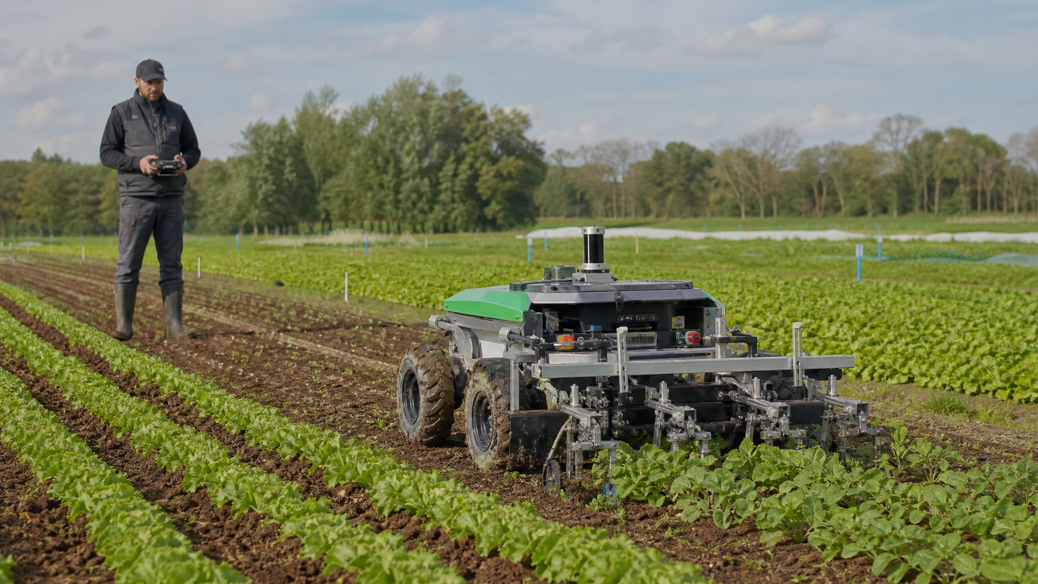
The broader push is not just about naming and presentation. At the Central Coffee Research Institute campus in Balehonnur, the Coffee Board also assessed a remote-operated weeding machine developed by a Tamil Nadu-based agritech company. Unlike conventional brush cutters, the machine can be controlled from a distance.
That matters because modern branding rarely stands alone. A global identity becomes more convincing when the sector behind it shows active investment in process, research, and operational improvement. Design does not need to illustrate every technical intervention, but it should leave room for that story.
In practice, the brand language around coffee can benefit from two distinct registers:
- Origin and diversity for buyers who care about place and product character.
- Capability and progress for buyers who want confidence in the sector’s future performance.
Those registers should not be mixed carelessly. One speaks through sensory and regional cues. The other speaks through evidence of coordination, research, and tools. When both are present, the brand feels less like a label and more like a system with direction.
Scale puts pressure on every design decision
The strategic backdrop is large. Under its Vision 2047 roadmap, the Coffee Board aims to raise annual coffee production from 3.5 lakh tonnes to seven lakh tonnes and generate Rs 50,000 crore in foreign exchange earnings.
Targets at that scale put real pressure on identity systems. A mark or packaging framework cannot be built only for a launch moment. It has to perform across more markets, more materials, more partners, and more product expressions over time.
That is where scalable asset thinking becomes useful. If INDICOF expands across trade booths, export documents, packaging, digital promotion, and region-led storytelling, the brand will need a library approach rather than a single hero graphic. Systems that grow well are usually tagged, governed, and reused with care, much like the thinking behind a scalable brand asset library.
For teams building these materials, motion can eventually help explain hierarchy and provenance in digital settings. A restrained logo reveal animation or a set of social media photo animation treatments could support launch materials later, especially when introducing one umbrella identity with many regional expressions. But those tools work best after the static system is resolved.
Clarity does more work than ornament
Origin-rich categories often tempt designers to overdescribe. Coffee invites texture, heritage cues, maps, seals, and layers of narrative. Yet a new global brand usually earns trust first by being easy to read.
Clarity does not mean thinness. It means every visible choice has a job. The parent identity establishes recognition. The regional layer preserves character. The supporting system helps buyers compare, remember, and return.
If INDICOF succeeds visually, it will not be because one name suddenly makes a complex coffee category simple. It will be because the brand gives that complexity a readable structure: one country, many regions, and a cleaner way for the world to see both.
 Logo Template
 Logo Template
 Logo Template
 Icon Template