
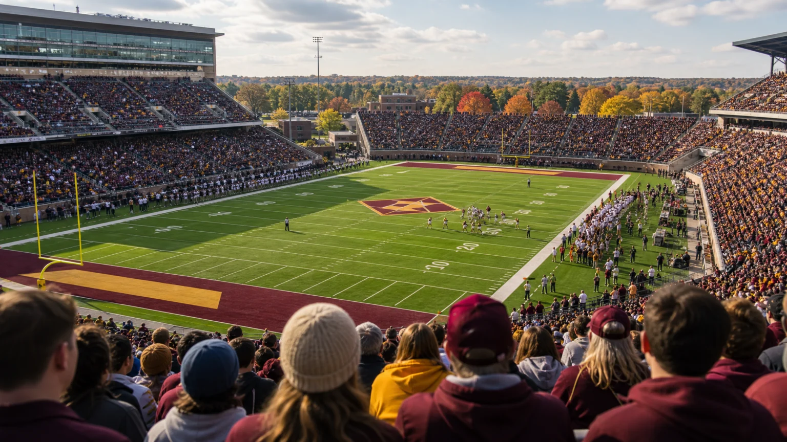
A painted football field is already crowded before a sponsor arrives. Yard lines, hash marks, numbers, end zones, conference marks, and school identity all compete for attention, so a corporate logo changes the balance at once. The field stops reading as a pure stage for team symbolism and becomes a negotiated branding surface.
This fall, Progressive will place its logo on 13 college football fields: Ole Miss, Georgia, Oregon, USC, Boise State, Colorado State, Iowa, Kansas State, Purdue, SMU, Syracuse, Texas Tech, and Wake Forest. The obvious gain is exposure, but the sharper design question is where that exposure sits. Turf is large, public, and impossible to scroll past.
Fields are now active brand real estate
The NCAA allowed colleges to contract for commercial sponsorship of football fields starting in 2024. That policy change turns one of the most symbolically guarded spaces in college sports into a sellable visual layer. Once that door opens, placement stops feeling exceptional and starts becoming part of the venue system.
This sits inside a broader expansion of corporate branding in sports venues and uniforms. From a design perspective, brands are no longer confined to the edges of sport. They are moving closer to the center of the performance.
That shift puts pressure on decisions about scale, color, and direction. A field logo has to read on television, hold together in wide stadium shots, and avoid fighting the school’s existing marks. It also has to survive motion: players crossing it, cameras panning over it, weather flattening or brightening color, and fans seeing it from much steeper angles than most brand systems anticipate.
Why this surface works differently from signage
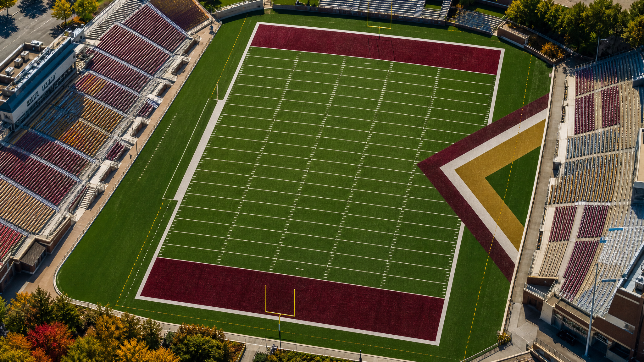
Stadium signage usually lives on the perimeter. Fans expect it there, and the eye can choose when to look. A logo painted on the field works differently because it shares the same plane as the game itself.
That gives the mark unusual authority. It is not wallpaper, but it is not the main event either. It reads more like an inserted signature on a tightly structured canvas.
Field branding is therefore closer to environmental design than to billboard design. The surface already has rules, measurements, and traditions. Any sponsor mark has to enter that system without breaking its visual timing.
At Ole Miss, this shift already reads as larger than a single sponsorship slot, which is why our earlier look at Progressive on the field at Ole Miss matters here. Once a brand reaches the turf, it starts affecting how people read the venue itself.
Placement tells the story as much as the logo does
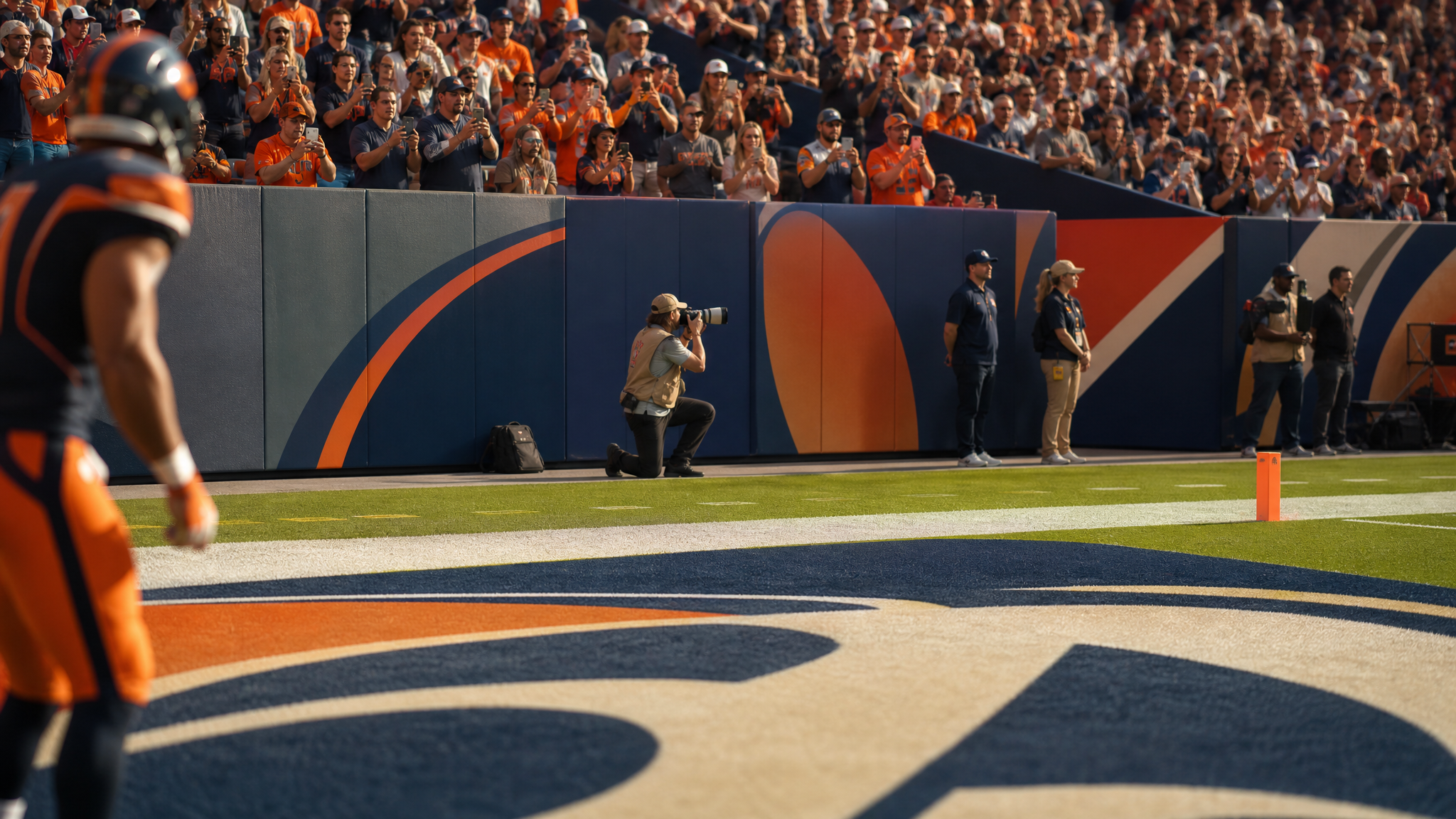
Georgia offers a useful example because the deal includes field logos, signage, and social media placements. That is a stronger system than a lone mark dropped into one location. It allows the same brand presence to appear across the stadium, the broadcast frame, and the digital feed, with each surface doing a different job.
Designers can read this as a lesson in consistency without duplication. A field application should not simply repeat what appears on a wall or in a post. Each touchpoint needs to respect its material, its scale, and its viewing distance.
Georgia also shows how quickly these surfaces can change hands. Last season, a Delta Air Lines logo was painted on the turf near the 20-yard line at Dooley Field. The swap points to a practical truth: even when a field feels permanent, its commercial layers may be temporary.
That temporary quality changes the standard. These marks need immediate recognition, clean reproduction, and enough restraint to coexist with a school’s own visual identity. There is little room for fine detail on a field that already carries stripes, numerals, and institutional history.
Exposure is obvious. Fit is harder.
Progressive is already one of the most recognized insurance brands in the United States, so the value here is not simple introduction. It is repeated visibility in a setting with strong audience attention and emotional charge. College football gives brands scale, loyalty, and repetition in one place.
Still, exposure alone does not make a placement feel right. A field logo has to look like it belongs long enough to avoid reading as clutter. That is where sports sponsorship design often succeeds or fails.
The challenge is easy to name and difficult to solve: the sponsor wants clarity, while the venue needs cohesion. If the logo overwhelms the school marks, the field feels rented out. If it is too quiet, the sponsorship loses value.
This same tension appears across sports branding more broadly. Our piece on fan-first social media approaches the issue from another angle: brand systems work better when they respect how audiences actually experience the space.
What designers and brand teams should notice
This 13-school rollout offers a few practical lessons.
- Surface changes meaning. A logo on turf is read differently from the same logo on a concourse sign or a social post.
- Context carries as much weight as scale. Large placement does not guarantee strong presence if the mark clashes with the field’s existing visual structure.
- Multi-touchpoint deals are usually stronger than isolated placements. Georgia’s combination of field logos, signage, and social media creates a fuller system.
- Temporary applications need fast legibility. Since sponsor marks can change from season to season, they need immediate recognition rather than slow discovery.
For schools, the implication is clear. Commercial access to the field should be treated as a design governance issue, not just a revenue line. Once branded placements become normal, institutions will need standards for position, visual weight, and coexistence with school symbols.
For brands, the field offers something rare: a chance to appear inside the event frame rather than around it. That opportunity is powerful, but it demands restraint. The strongest field branding usually feels deliberate, not loud.
A new normal for college sports visuals
The notable part is not simply that one insurer gained 13 placements this fall. It is that college football fields are now functioning more openly as branded media surfaces. That changes how campuses, sponsors, broadcasters, and fans will read the same piece of ground.
As more corporate marks move into sports venues and uniforms, the visual culture of college athletics will keep shifting. Some placements will feel natural. Others will reveal how narrow the margin is between useful visibility and visual interference.
A field is enormous, but it is not empty. Every added mark has to earn its place inside a surface that already carries memory, ritual, and attention.
 Logo Template
 Icon Template
 Icon Template
 Icon Template


