
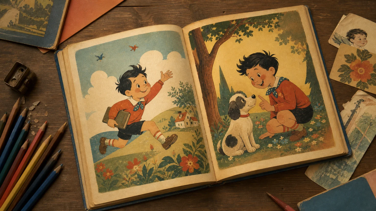
The striking part is not that a major public spectacle had branding. It is that the branding was clear enough for children, using friendly visual cues to make a vast economic and cultural project feel small, knowable, and desirable.
The 1939 New York World’s Fair has been described as the 20th century’s most aggressively branded peacetime marketing event. That shifts the fair from backdrop to design system. It was a corporate-sponsored, designer-conceived revision of a world shaken by economic catastrophe, and it staged capitalism as a spectacle.
Within that setting, a children’s publication from 1938 offers a sharp object lesson. Johnny’s So Long at the Fair: Oh Dear, What Can the Matter Be?, designed by the unknown Märta, can be understood as an early brand guide aimed at children: a compact visual package built to capture attention, affection, and spending power.
Why this artifact matters
Design history often gets flattened into logos, posters, and headline moments. This piece asks for a closer look at the smaller instruments of persuasion. A child-facing publication can carry the same strategic intent as a formal identity manual while appearing softer and more innocent on the surface.
That is what makes it useful now. It shows how branding travels through everyday forms, especially when the audience is too young to describe what is happening but old enough to feel attraction, familiarity, and trust.
The object sits at the intersection of branding, childhood marketing, and visual culture. It is not simply decoration for an event. It is a visual script for how a child might meet a public institution through charm rather than argument.
The persuasive work of style
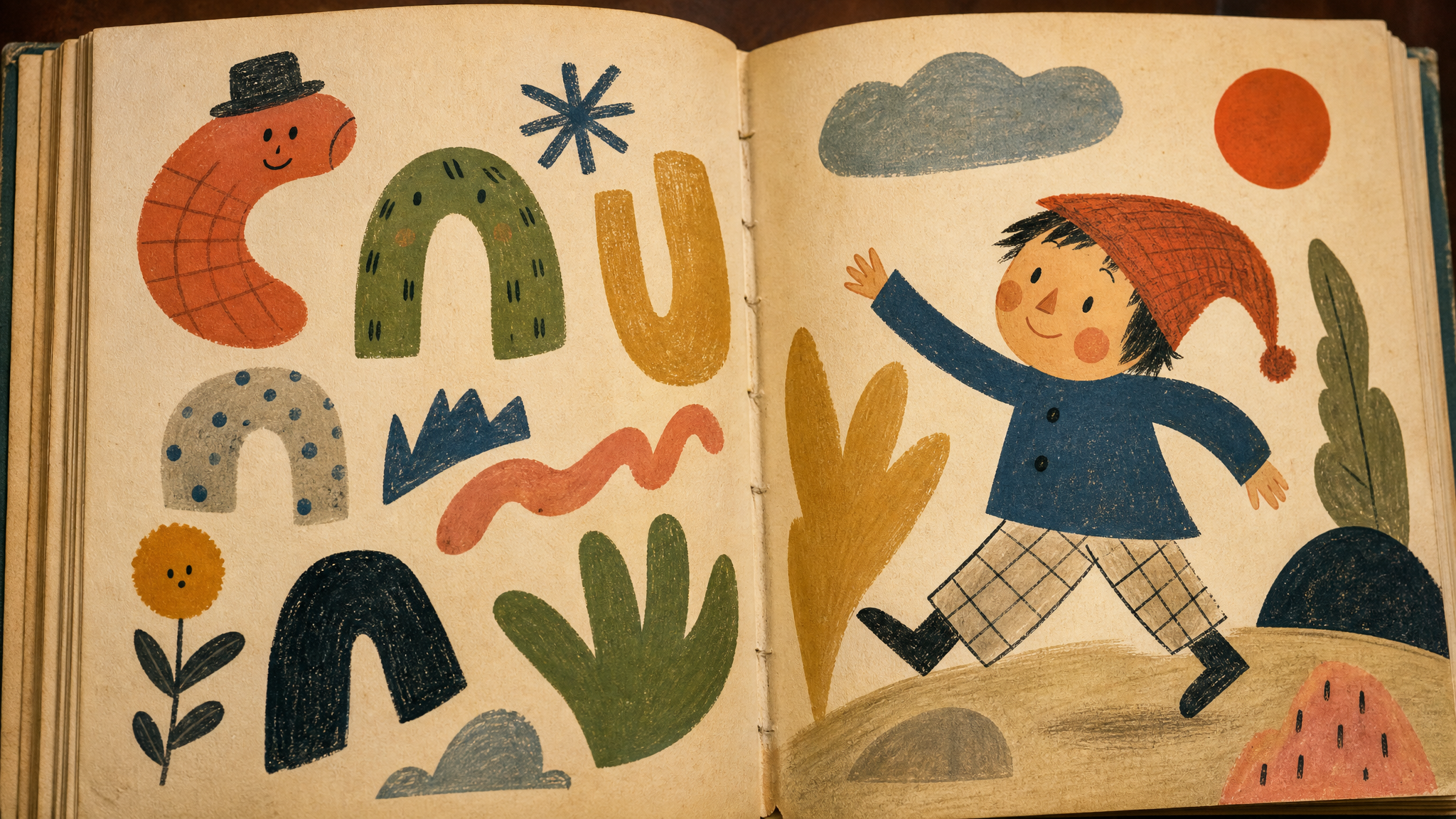
Three elements stand out: drawing style, lettering, and character design. Each does practical work. Together they create a signature that feels welcoming before any larger message is consciously processed.
Drawing style sets the emotional temperature first. A child-oriented illustration style can reduce distance, smooth complexity, and turn a vast fair into something manageable. What might feel monumental, commercial, or abstract becomes approachable through line, shape, and expression.
Lettering plays a different role. It gives tone a visible body. In children’s material, letterforms often establish friendliness and timing, carrying mood as much as words do.
Characters complete the mechanism. A character can stand in for the institution, guide attention, and make persuasion feel personal. Once a face or figure enters the composition, the message gains direction: the child is no longer just looking at information but following someone through it.
This helps explain why mascot design remains so consequential in brand systems. Symbolic figures can take on meanings far beyond their original use, as explored in our look at what mascot disputes reveal about brand design. In a child-facing context, that expressive power becomes even more delicate.
What makes it feel like an early brand guide
A brand guide does not need to be a ring-bound standards manual to act like one. If an artifact coordinates visual choices so an audience recognizes a world, trusts its tone, and understands how to move through it, it is already doing brand work.
This 1938 publication appears to do exactly that. It packages the fair as a coherent experience for children, using persuasion through style rather than instruction alone. The point is less about information than about making the fair feel like a place a child should want to enter.
That distinction matters. Strong brand systems rarely begin with explanation. They begin with atmosphere, repetition, and cues that help an audience understand what belongs. In child-directed design, those cues often arrive through illustration and lettering before they ever arrive through policy, mission, or institutional language.
Designers working on rollout systems will recognize the pattern. Brand value often lives less in the reveal than in the repeatable tools that carry it into daily contact, a point explored in our piece on why branding guidelines matter more in rollout than reveal.
Childhood is where visual trust gets built

Children are a demanding audience in one sense and a vulnerable one in another. They notice shape, color, expression, and narrative invitation quickly. They do not arrive with a stable filter for institutional motives.
That gap is where visual persuasion becomes especially powerful. A cheerful figure, a lively page, or inviting lettering can make ideology feel like entertainment. The mechanism is not hidden exactly; it is wrapped in a form that appears harmless.
This is not a warning against illustration or warmth. It is a reminder that softness is never neutral. Every friendly surface carries choices about what gets normalized, who gets invited, and what kind of social performance the audience is being asked to join.
Seen this way, children’s branding is often less about selling a single ticket, object, or outing than about rehearsing habits of attention. It teaches what authority looks like when authority wants to be loved.
The fair as total environment
The broader setting matters because the fair was more than an event. It was a stage on which commerce, design, and public imagination were brought into alignment. In that kind of environment, branding does not sit on top of experience. It helps organize the experience from the start.
That is why a child-focused artifact belongs at the center of the conversation, not the margins. If the fair presented a revised vision of the world after economic upheaval, then its children’s materials helped introduce that world at eye level. They gave the larger project a friendly face and a usable scale.
There is a practical lesson here for designers. A visual system is strongest when every part, from monumental display to small printed ephemera, moves with the same rhythm. The child’s booklet and the public spectacle are not separate stories. They are parts of one coordinated persuasion system.
What this teaches contemporary brand designers
First, small artifacts matter. A booklet, handout, package, sticker, or in-store card can do strategic work far beyond its size. These pieces often create the most intimate contact with an audience, which makes their visual choices unusually consequential.
Second, style is never just style. Drawing approach, lettering, and character design shape belief as much as recognition. They tell audiences how guarded or open to be, how serious or playful to feel, and whether the institution in front of them seems distant or familiar.
Third, audience age changes the ethics of the brief. When the viewer is a child, clarity and delight still matter, but so does restraint. The more persuasive the visual language becomes, the more carefully its purpose should be examined.
Branding also has a long memory. Child-facing systems can look light compared with corporate identity or civic design, but history suggests otherwise. These are often the places where visual language does its deepest cultural work, because it arrives early and stays with the viewer.
The lesson from this 1938 fair publication is simple and sharp. When design teaches children how to feel about a world before they are fully able to question it, branding is no longer a finishing layer. It is part of the world-building itself.
 Logo Template
 Photo Template
 Photo Template
 Icon Template


