Luxury hospitality gets less persuasive the moment it sounds interchangeable. The more exclusive the promise, the more clearly a place has to show why it belongs exactly there. A new resort and branded residential development in Puerto Rico brings that tension into focus by tying identity to architecture instead of leaving the work to naming, amenities, and prestige language.
The project, Amantaru, sits squarely in branded hospitality and residential development. That makes it useful for designers because these projects do not sell a room alone. They sell atmosphere, permanence, and a picture of life that has to feel specific enough to remember.
Architecture acts as the first brand surface
Amantaru is designed by Masastudio, with architect Marwan Al-Sayed named as cofounder of the Los Angeles-based firm. That matters because authorship changes how a development reads. A property starts to feel less like a generic luxury container and more like a designed point of view.
When architecture takes the lead, branding gains substance. Materials, silhouettes, thresholds, and sightlines start carrying the signature before any guest encounters printed matter or digital touchpoints. In hospitality, that is often the strongest kind of identity system because it works at full scale.
This is one reason brand teams in adjacent sectors keep looking at built environments for cues. In cities where graphics start acting like architecture, structure and recognition begin to overlap. Hotels and residences flip that relationship: architecture starts doing graphic work.
Local reference gives luxury clearer direction
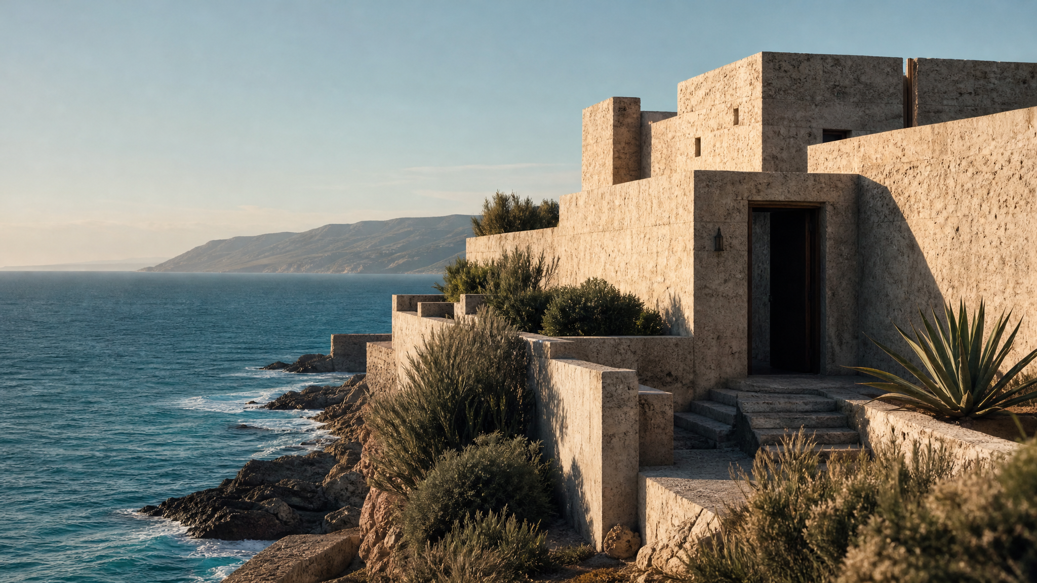
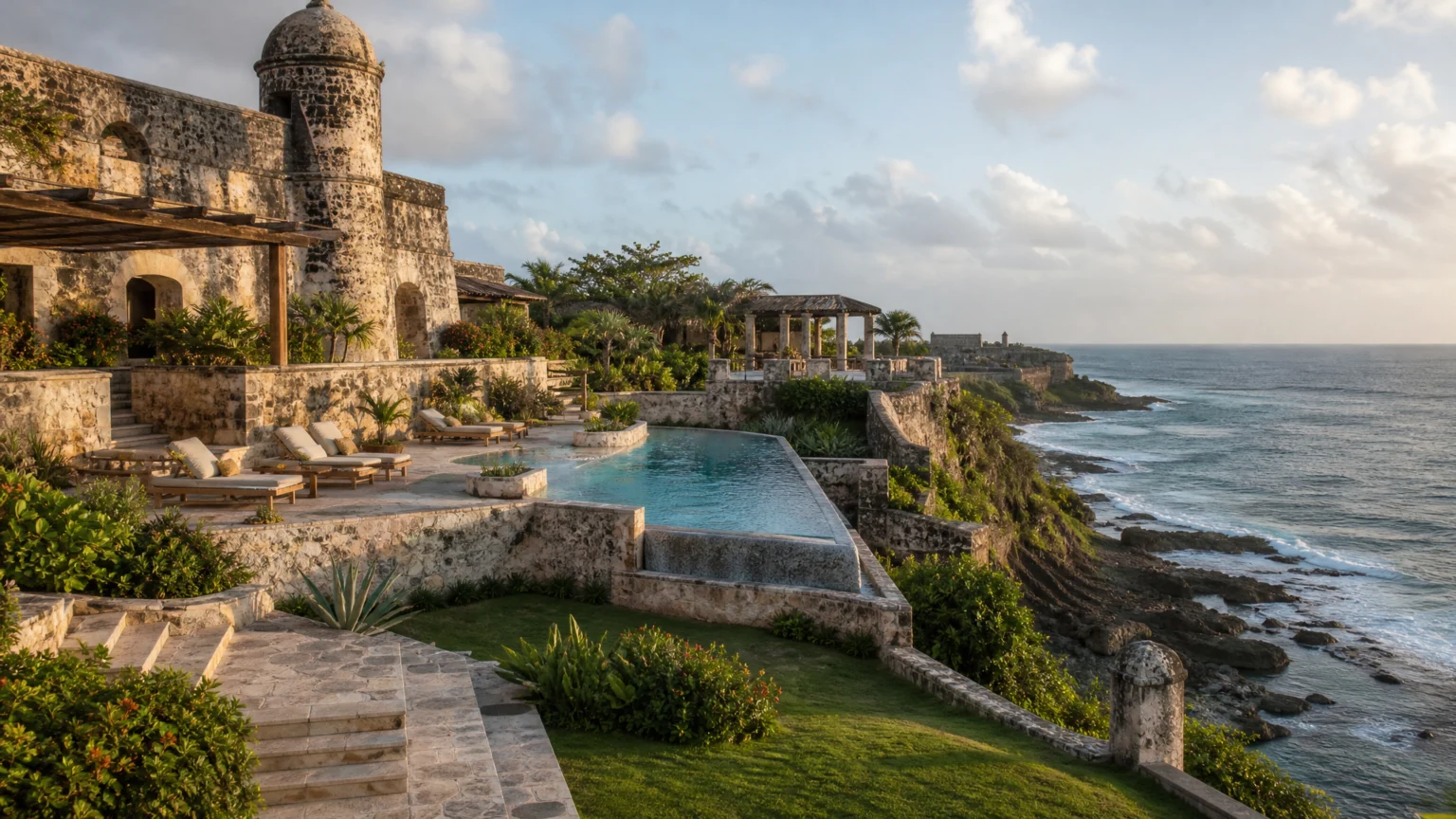
The design concept draws inspiration from Puerto Rico’s historic forts and coastal landscapes. That is more disciplined than vague claims about elegance or calm. Historic fort forms suggest mass, edge, defense, and horizon, while coastal landscapes suggest openness, light, and terrain.
For designers, the practical lesson is simple. A place brand gets sharper when its references come from forms people can actually see and feel, not just values they are supposed to admire. Local identity becomes legible through contour, proportion, shadow, and the timing of arrival from one space to the next.
That does not require direct imitation. It means borrowing a logic. Forts and coastlines can guide wall thickness, spatial compression, framed views, and the relationship between solid mass and open air. Those choices usually age better than decorative symbolism added later.
Named architects are shaping luxury identity more often
This is not an isolated pattern. Another hospitality project in the same news cycle is set to have its design led by Studio MK27, the São Paulo-based architecture firm founded by Marcio Kogan. The recurring move is clear: luxury operators increasingly use named architects and strong design authorship as part of how the brand is understood.
That shift changes the brief. Instead of asking a visual identity to generate distinction from scratch, teams can build from a physical concept that already has weight and texture. The brand becomes more believable because the setting is already doing part of the work.
Rosewood offers a useful contrast. Its philosophy, “A Sense of Place,” is built around properties inspired by the cultural identity of each destination. The wording works because it points to a design standard, not just a tone. In hospitality, destination identity is often the difference between a memorable experience and a luxury product that could be anywhere.
Visible form outperforms promotional language
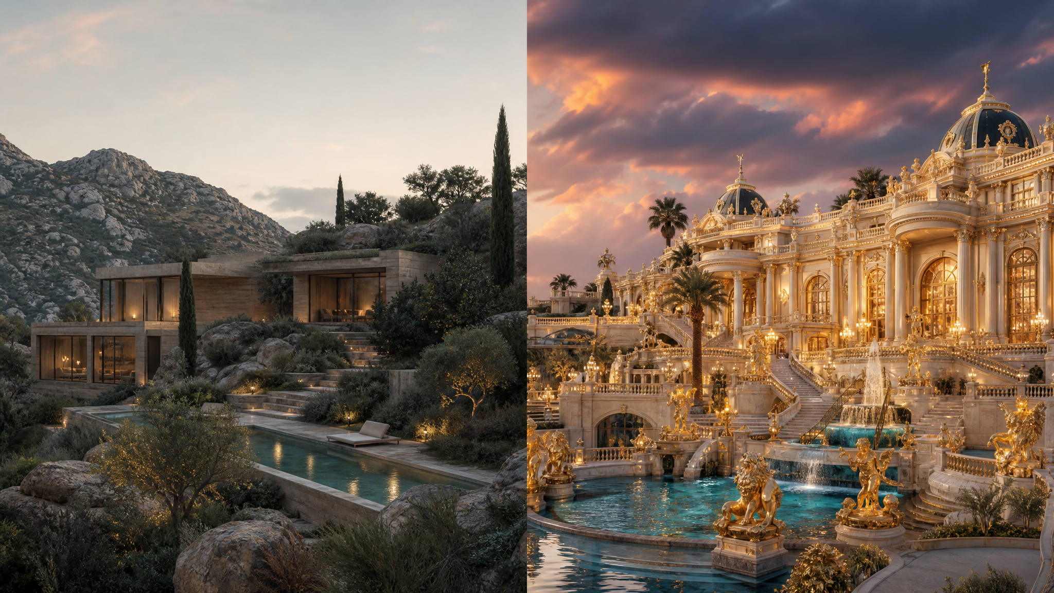
Branded developments often arrive wrapped in polished promises about serenity, seclusion, and integration with nature. Those phrases are familiar, but they stay thin unless the built environment makes them visible. A courtyard can express seclusion. A framed ocean edge can express serenity. A structure set carefully into terrain can suggest integration.
That gives designers a useful filter for presentations, launch films, and property websites. If the concept cannot be shown through massing, landscape relationships, circulation, and material contrast, the identity is probably still underdesigned.
Hospitality teams can also borrow a cue from retail and editorial image-making: show fewer generic luxury signals and more evidence of place. The same discipline that helps avoid interchangeable stock aesthetics in brand photography choices applies here. Specificity beats polish when trust is at stake.
Context still shapes perception
The development has faced opposition from several community groups, which argue it would place additional strain on electricity and water infrastructure. That matters because place branding never operates outside local conditions, no matter how refined the visual package becomes.
For designers, this is where restraint helps. If a project exists inside public concern, the identity should avoid acting louder than the facts on the ground. Clear environmental diagrams, honest site visualizations, and measured storytelling usually carry more credibility than cinematic excess.
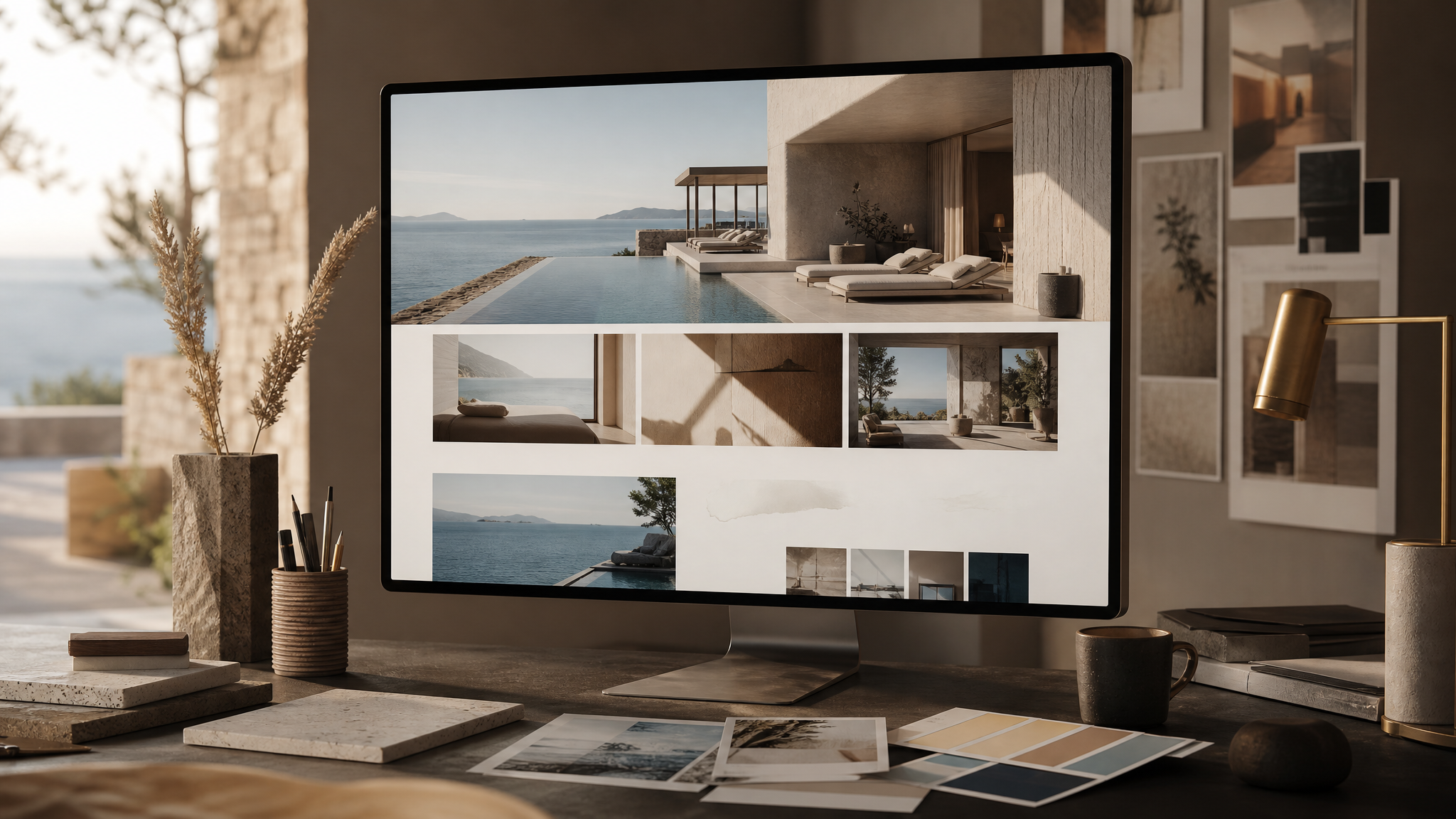
The same principle applies to motion. If a hospitality brand uses animation for a launch page or teaser, subtle depth, light, and camera movement can support atmosphere without overstating certainty. Pages built with cinematic photo animation or depth map parallax work best when they reveal spatial character rather than manufacture grandeur.
Better early questions improve the whole system
A project like this suggests a stronger briefing sequence for branded developments:
- What physical references are shaping the architecture? Named forms and landscapes produce stronger visual systems than abstract mood words.
- Who is the design author? A lead architect or studio often signals the intended character more clearly than launch copy.
- How does destination identity appear in built form? The answer should be visible in plan, section, materials, and approach.
- What local concerns will affect perception? Context changes how every image, rendering, and brand claim will be read.
Those questions improve more than the identity. They improve asset selection, art direction, website structure, and the reveal sequence. The strongest branded places do not begin with decoration. They begin with a coherent relationship between land, form, and meaning.
A place brand lands harder when it looks built
Amantaru stands out because the most useful detail is not the luxury positioning alone. It is the decision to ground the development in architectural references tied to Puerto Rico’s forts and coastal landscapes, with Masastudio and Marwan Al-Sayed shaping that idea into form.
That is the larger design lesson. In high-end hospitality and residences, identity feels more convincing when walls, edges, and views carry the message first. When architecture does that work, the rest of the brand can speak more quietly and still leave a lasting impression.
 Icon Template
 Icon Template
 Logo Template
 Photo Template