The painted surface does the first piece of work, but it is the repeatability underneath that makes the case persuasive. Distinctive pottery from Qurayyah in Northwestern Arabia shows how recognition can travel through form, finish, and distribution long before advertising, packaging systems, or trademark law enter the picture.
Researchers argue that this pottery functioned in ways similar to a modern brand. The point holds because it is not based on a catchy comparison. It rests on a set of criteria about identity, production, movement, and reputation.
The object carried its own identity
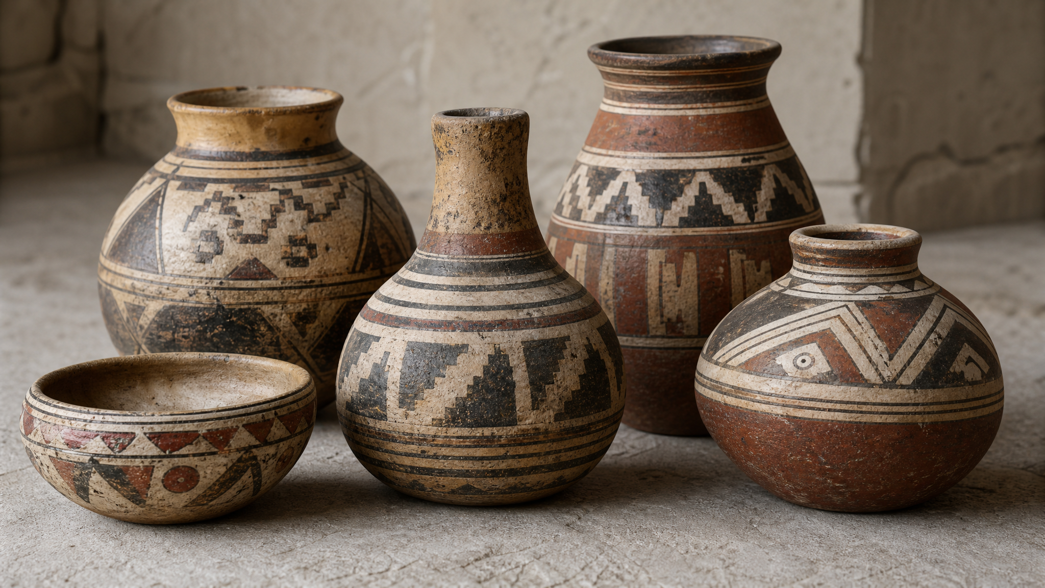
The pottery was distinctive enough to be treated as more than a local craft habit. Researchers identified branding-related criteria that included visual identity, material consistency, technological continuity, centralized production, export circulation, local imitation, intentional commercial scope, and cultural reputation.
That list is useful because it separates appearance from performance. A recognizable look matters more when the same look is backed by repeatable making methods and steady quality. Identity becomes believable when the object keeps its signature across time and distance.
Designers work with the same tension now. A mark, color, or pattern can catch the eye, but consistency is what teaches people to trust the signal. Recognizability alone can still be too narrow if the visual system cannot move across formats, uses, and audiences.
Material consistency made the argument stronger
The strongest part of this case is material, not rhetorical. Researchers combined examination of stratified material, vessel-shaping technology, and petrographic analysis of ceramic thin sections. They cross-checked those findings with chemical fingerprinting of the vessels’ composition down to trace elements using Neutron Activation Analysis.
For brand thinking, that matters because it ties surface appearance to production reality. The painted look was not just decoration. It was connected to repeatable methods and identifiable origin, which is exactly how visual culture gains durability instead of fading as a short-lived style.
A stable identity works best when form and making support each other. When the visible layer and the production layer stay aligned, recognition becomes easier to sustain.
This is a useful reminder for teams building asset libraries, packaging systems, or motion kits. The visible style should not sit apart from the process that produces it. Organized digital assets serve the same purpose in contemporary practice: they protect continuity so the output keeps the same direction each time it appears.
Travel proved the identity could hold

The pottery tradition stretched across a long period, and the vessels were exported over hundreds of kilometers north to the Southern Levant and south to North Arabia. That is where the idea becomes especially convincing. An identity means more when it survives travel.
Local familiarity can make almost anything legible. Distance is the harder test. Once an object leaves its place of origin, it needs enough visual clarity and enough production consistency to be recognized, desired, and exchanged by people who did not witness its making.
That is still how brands work. A system proves itself when it holds together outside the studio, outside the launch deck, and outside the home market. The performance depends on repeatable cues that people can read quickly, then remember later.
Imitation showed the look had value
One of the criteria in the researchers’ framework is local imitation. That detail is easy to miss, but it is one of the clearest signals. Objects tend to be copied when their appearance carries value beyond utility.
Imitation suggests that the pottery had become culturally legible and commercially meaningful. People were not just using vessels. They were responding to a recognizable visual language attached to desirability and reputation.
Design history returns to this pattern often. Once a form becomes socially useful, others borrow its proportions, motifs, materials, or finish to access some of the same meaning. That does not diminish the original object. It often confirms that its visual choices entered circulation strongly enough to shape behavior around them.
Reputation depended on more than surface pattern
The researchers’ criteria include intentional commercial scope and cultural reputation, which help explain why the pottery can be discussed in branding terms at all. A pattern alone is not a brand. A repeated look becomes brand-like when people connect it to expected qualities, known origin, and shared desirability.
That distinction stays useful in design work. Style can attract first attention, but reputation is built by repetition, availability, and a reliable result. The rhythm between object, maker, and audience is what turns a visual cue into a lasting association.
This is one reason motion and identity systems work best when they reinforce what is already true rather than covering gaps. A visual system can travel farther when it expresses a stable core. Teams exploring logo reveal animation face the same principle in another medium: movement helps recognition when the underlying identity is already coherent.
Brand logic existed before brand language
The most interesting part of this pottery is not that it feels ancient and familiar at once. It is that the logic still feels current. Visual identity, production consistency, circulation, imitation, and reputation still define how recognizable objects gain cultural weight.
That does not mean every repeated motif from the past should be called a brand. It means the category becomes useful when there is enough evidence that an object system behaved like one. Here, the case is grounded in visual distinction, technical continuity, centralized production, export circulation, and broad recognizability.
For designers, the practical lesson is straightforward. A brand rarely comes from a symbol alone. It emerges when appearance, process, and distribution stay coordinated long enough for people to identify the object, want it, and recognize it again in a different setting.
 Logo Template
 Photo Template
 Logo Template
 Photo Template