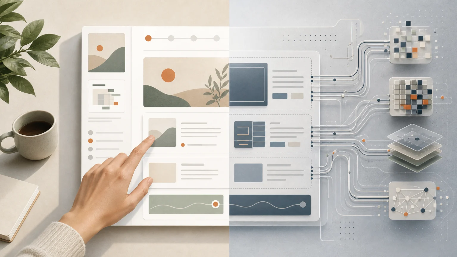
A polished page can still break at the moment of use. The issue is no longer just human attention. More web pages now have to stay legible to people while becoming easier for AI agents to parse, navigate, and act on.
That changes the job of design in practical ways. Layout, labels, hierarchy, and markup no longer serve human scanning alone. They also shape whether a system can find the right button, interpret a product option, and complete a task without taking extra steps.
In a controlled e-commerce experiment, AI browser agents completed 89% of tasks on a website redesigned for machine consumption, compared with 49% on the identical human-oriented version. They also needed 30% fewer steps. Those figures should be treated as provisional because the authors built both variants themselves, no ablation study isolated each change, and the hardest multi-constraint task missed statistical significance. Even with those caveats, the design direction is difficult to dismiss.
The useful lesson is straightforward. Pages that communicate intent clearly tend to help both audiences. That means publishing structured data, using semantic HTML, labeling actions unambiguously, and testing with agents instead of assuming visual polish will carry the whole task.
Structure is back in the foreground
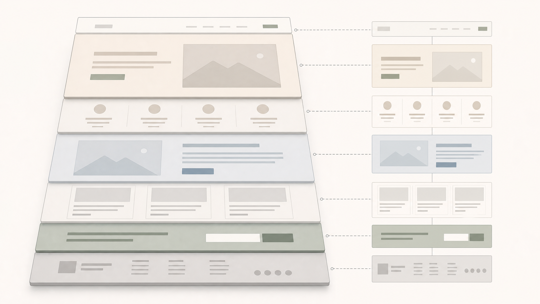
For years, many teams treated structure as back-of-house work while styling took the spotlight. AI agents pull that balance back toward the center. A page now needs a clear skeleton because machine readers depend on it to understand page purpose, available actions, and state.
Semantic HTML matters because it names page parts honestly. Structured data matters because it reduces guesswork. Clear action labels matter because a vague button creates hesitation for humans and confusion for systems.
This is the same instinct behind readable product pages and stable hierarchy. Clear grouping, predictable naming, and accurate states reduce friction before anyone notices the visual signature. That is part of why a strong typography system for product pages still matters in an AI-shaped web.
Task success begins before any click
When an agent fails, the problem often starts far upstream. Muddy information architecture, duplicated meanings, weak labels, or controls disguised by clever language can send the task off course before checkout or form entry ever begins.
Designers already know that shoppers arrive with intent, not patience. The same logic applies when an assistant is acting on that shopper’s behalf. If product variants are buried, calls to action sound interchangeable, or key details appear only through presentation instead of meaning, the path loses direction.
That makes testing more concrete. Instead of asking only whether a page looks current, teams can ask whether a system can identify the main action, distinguish one option from another, and confirm progress honestly. The strongest fixes are often ordinary ones: rename a button, expose state, reduce duplicated paths, or make a hidden dependency explicit.
Progress cues need to reflect real state
The goal-gradient effect gives this a useful psychological edge. People tend to move with more energy when progress is visible, especially in multi-step flows. Good progress indicators show position clearly and tie that indicator to actual state rather than decoration.
That advice carries well into agent-ready design. A flow that exposes the current step, remaining steps, and completion conditions is easier to recover when something goes wrong. It also lowers the chance that a system or a person mistakes movement for progress.
Progress UI is often treated as a cosmetic detail. It is closer to choreography than ornament. It tells the user where they are, what changed, and what can happen next.
Open canvases still need fixed anchors
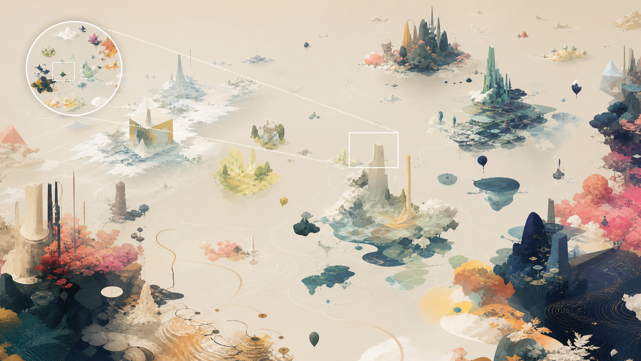
The same principle appears in infinite canvas interfaces. An infinite canvas is a two-dimensional workspace with no fixed boundaries, and it has a long lineage through Sketchpad, Pad++, and ideas popularized by Scott McCloud.
These spaces feel generous because they remove the hard edge of the page. They can also become disorienting quickly. That is why minimaps, landmarks, zoom-to-fit controls, and accessibility outlines matter so much. Freedom without orientation turns into drift.
For designers, the lesson is simple. Expansion needs reference points. If a workspace can grow in every direction, users need stable anchors to keep their place, compare scale, and recover context after movement. The larger the canvas, the more careful the timing of these cues has to be.
That same need for orientation appears across visual systems. Motion, hierarchy, and placement only help when they reveal where the user is and what object matters now. Teams building moving interface elements can learn from how color and motion create order in sequence-based design, especially when state needs to stay legible across transitions.
Simplification can sharpen meaning
Scott McCloud’s principle of amplification through simplification still applies cleanly to interface work. Simplified images often communicate more than photorealistic ones because they remove competing detail and let meaning arrive faster.
That does not mean flattening everything into generic icons or sterile diagrams. It means knowing which details carry meaning and which ones add surface noise. In interfaces, illustrations, and onboarding visuals, simplified forms often improve recognition, scanning, and memory.
This matters even more when human users and AI systems are interpreting the same environment. Clean distinctions, fewer competing signals, and obvious relationships make interfaces easier to act on. The page gains clarity without losing warmth.
AI help works best as a side path

The same discipline shows up inside AI-assisted creative tools. In one study, an AI storytelling tool helped weaker child storytellers but harmed top performers. That split matters because assistance can support one group while constraining another.
The best design response is not to remove assistance. It is to frame assistance correctly. Build escape hatches for strong users. Make AI an offer, not an order. Let people accept help when they need it and step past it when they already have a plan.
This is especially relevant in creative software, where confidence and control vary from one user to the next. Good tools lower the floor without flattening the build. The same balance runs through careful thinking about access, skill, and creative control.
Machine-ready should not mean lifeless
One risk in this moment is overcorrecting. Teams may hear machine-ready and strip pages into bare utility. That would miss the point. Agent-ready design is not a license for generic experiences. It is a demand for honest structure beneath expressive surfaces.
The stronger pattern is to separate clarity from blandness. A page can use voice, image, texture, and restraint while still exposing meaning cleanly through markup, labels, and information architecture. It can feel considered to a person and legible to a system.
- Use semantic HTML so page parts carry their real meaning.
- Publish structured data where entities, options, and relationships need less guesswork.
- Label actions plainly so users and agents can distinguish outcomes.
- Show real progress state in multi-step flows.
- Add anchors in open workspaces with minimaps, landmarks, and zoom-to-fit.
- Keep AI assistance optional with escape hatches for advanced users.
- Test with agents directly instead of relying on visual review alone.
One behavioral signal makes the shift harder to ignore: shoppers are choosing AI assistants over brand websites by a margin of 41% to 38%. That does not make the website irrelevant. It makes the website more infrastructural. Its job is no longer limited to persuading a visitor. It also has to supply a system with clean, reliable meaning.
Designers have seen this pattern before. A surface changes, then the deeper craft becomes visible again. In this case, the quiet work of naming, structuring, and guiding is moving back to the center. The pages that perform best will likely be the ones that look calm, say exactly what they mean, and give every user a clearer path through the room.
 Logo Template
 Photo Template
 Photo Template
 Logo Template