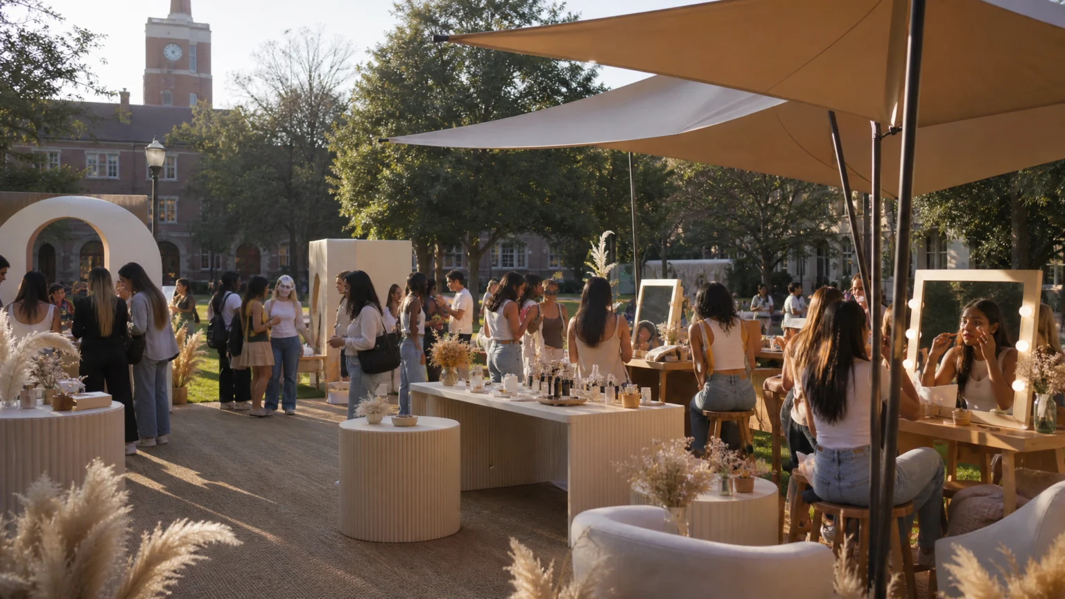
A folding table distributes product. A designed setting changes behavior. That gap explains why some campus activations attract a quick glance while others pull students in long enough to matter.
Recent back-to-campus work from Sephora at Kohl’s, CeraVe, and Sally Beauty makes the contrast easy to see. Each brand built around a real student need, but each used a different visual and spatial approach. Together, they show three practical models: prepare someone for a social moment, redesign a familiar habit, or turn product discovery into participation.
Sephora at Kohl’s framed the moment around recruitment
Sephora at Kohl’s returned to three major college campuses with a recurring activation called Beauty Corner, tied to sorority recruitment. That repeat appearance matters. A named campus concept feels less like a one-off promotion and more like something students can recognize on sight.
The activation offered quick beauty appointments to get students rush ready. It also included postcards, giveaways, stickers, and a Beauty Bodega-themed photo op. Each piece had a clear job: service reduced friction, postcards extended the experience beyond campus, and the photo setup gave the space a focal point.
The strength here is timing. Students heading into recruitment are already thinking about presentation, nerves, and social logistics. An activation built around confidence does not need to overperform when the use case is this specific. It needs to read quickly and help within a short visit.
That is a useful lesson in layered utility. One environment supported preparation, keepsakes, and documentation without asking for all of a student’s attention at once. The room handled the sequence.
CeraVe redesigned the setting instead of repeating the message
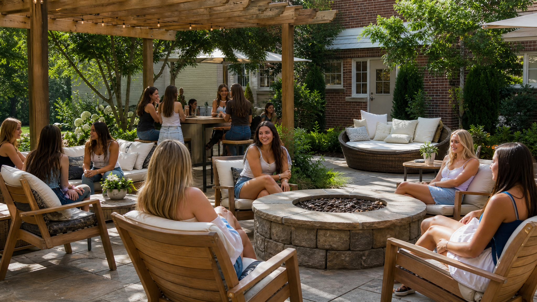
CeraVe took a different route. Rather than leaning on influencer gifting, the brand renovated Tri Delta’s backyard at Florida State University and turned a sun-drenched outdoor area into a sun-safe destination.
That choice shows strong environmental thinking. CeraVe identified tanning culture as a returning behavior among Gen Z and college students, then went to the place where those sun habits happen. Instead of repeating a health reminder, the brand changed the conditions around the behavior.
This is a sharper visual move than it may first seem. A renovated backyard carries proof in its surfaces: shade, seating, layout, and use become part of the message. Students do not need to translate abstract advice into action because the intervention is already waiting where the choice gets made.
For brand teams, that is a reminder that awareness is not always the main assignment. Sometimes the better brief is spatial. When the brand lives in the room, adoption can feel more natural because design supports behavior instead of just describing it.
Sally Beauty brought an existing concept onto campus
Sally Beauty expanded its existing COLORfest concept to college campuses. That is a practical advantage many brands miss. Extending a format that already has structure often produces stronger campus work than inventing a separate identity for a short run.
Students could discover new products through hands-on activities and giveaways. In beauty retail, that matters. Color, finish, and personal fit are difficult to explain from a shelf card alone, so trial becomes part of the message.
Hands-on discovery also gives the activation clear direction. The brand stops being a backdrop and becomes a simple progression: arrive, test, compare, react, share. Even giveaways feel more grounded when they follow an experience instead of standing in for one.
There is a useful economy in that approach. A concept with a name, a mood, and recognizable parts can travel across campuses without losing shape. Small adjustments can localize the presentation, while the core frame stays legible.
Student behavior gave all three activations their structure
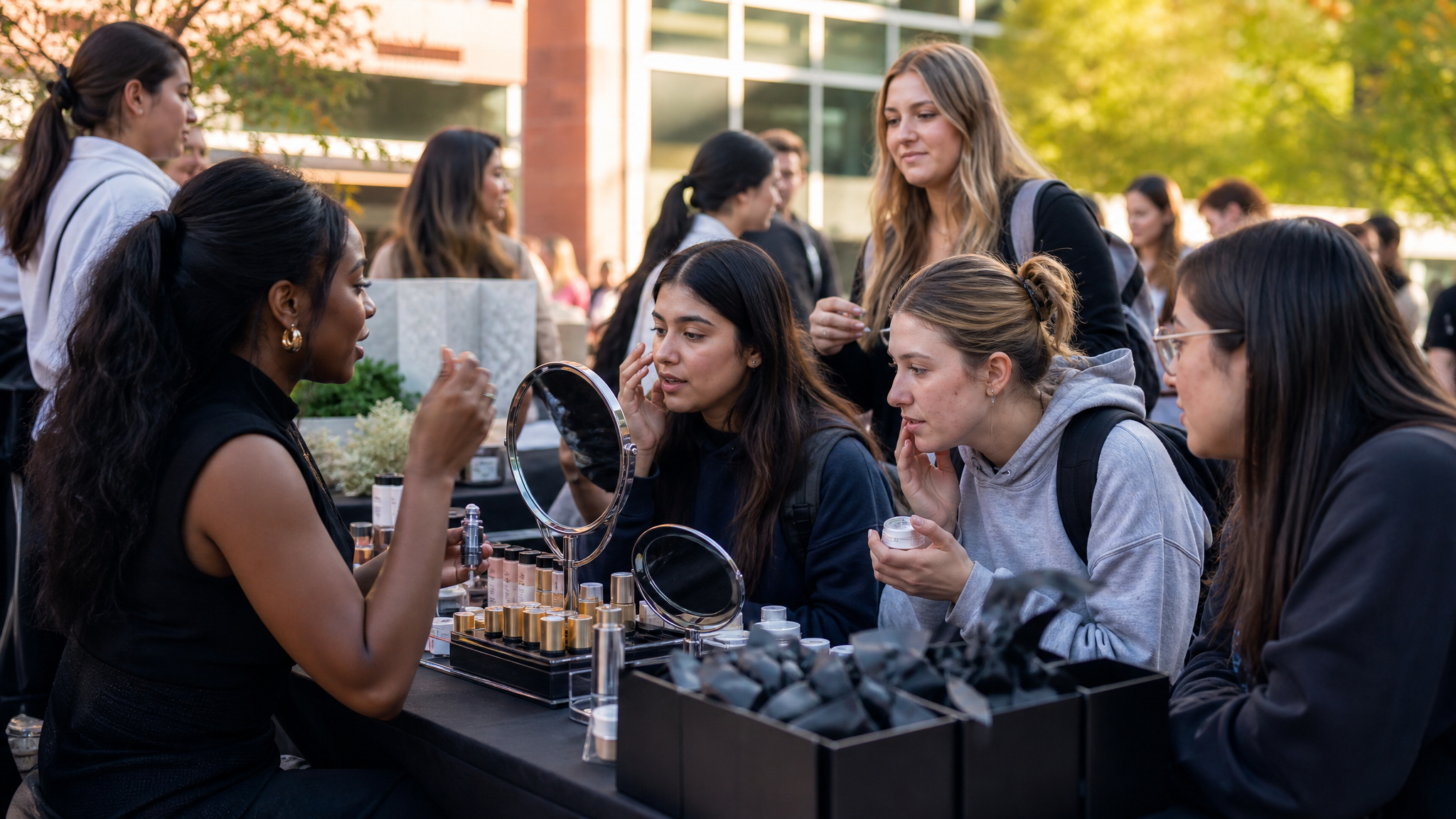
These activations differ in tone and format, but they share one structural principle. Each ties the brand to a student behavior that is already in motion.
- Sephora at Kohl’s supported preparation around sorority recruitment.
- CeraVe intervened in outdoor tanning habits through a redesigned space.
- Sally Beauty turned product exploration into hands-on campus activity.
That is why they feel more considered than generic sampling. None of them starts with distribution alone. Each begins with a situation: getting ready, spending time outside, or trying beauty products with friends.
This is close to the same principle behind campaigns that look bigger than their budget. A focused idea tends to produce cleaner visual decisions. Once the behavior is defined, props, surfaces, and interactions know where to go.
Concrete details make campus branding feel credible
Campus audiences quickly notice when a brand arrives with a prefab scene and no feel for context. These examples avoid that problem by using details students can act on immediately.
A quick beauty appointment is concrete. A postcard sent to family back home is concrete. A renovated backyard is concrete. Hands-on product discovery is concrete. These are not broad lifestyle gestures. They are designed actions with an obvious purpose.
That clarity matters visually as well. When an activation has a simple job, the graphic system can stay calmer. Signage does not need to overexplain, and styling can support the mood without carrying the whole argument.
That usually leads to better content after the event too. If the space, interaction, and focal action are already clear, photography and short video have a stronger base. Specific scenes tend to travel well into social edits, especially when the original environment already gives people something distinct to capture. For that stage, a tool built for social media photo animation can extend the life of a strong still without changing its basic character.
Campus work lands when context leads the design
Gen Z-friendly campus activations are often described as clever, but cleverness is not the main lesson here. Fit is. In each case, the strongest move was not a slogan or a stunt. It was the decision to place the brand inside a behavior students already recognized.
That is why Beauty Corner could support recruitment confidence, why a sun-safe backyard could speak more clearly than a warning, and why COLORfest could hold its appeal on campus. The visual system matters, but the setting comes first.
Good campus branding does not just show up where students are. It notices what the room is for, what the hour feels like, and what kind of help will read as genuine. Once those pieces are in place, the rest of the design has a much easier job.
 Photo Template
 Photo Template
 Logo Template
 Logo Template