
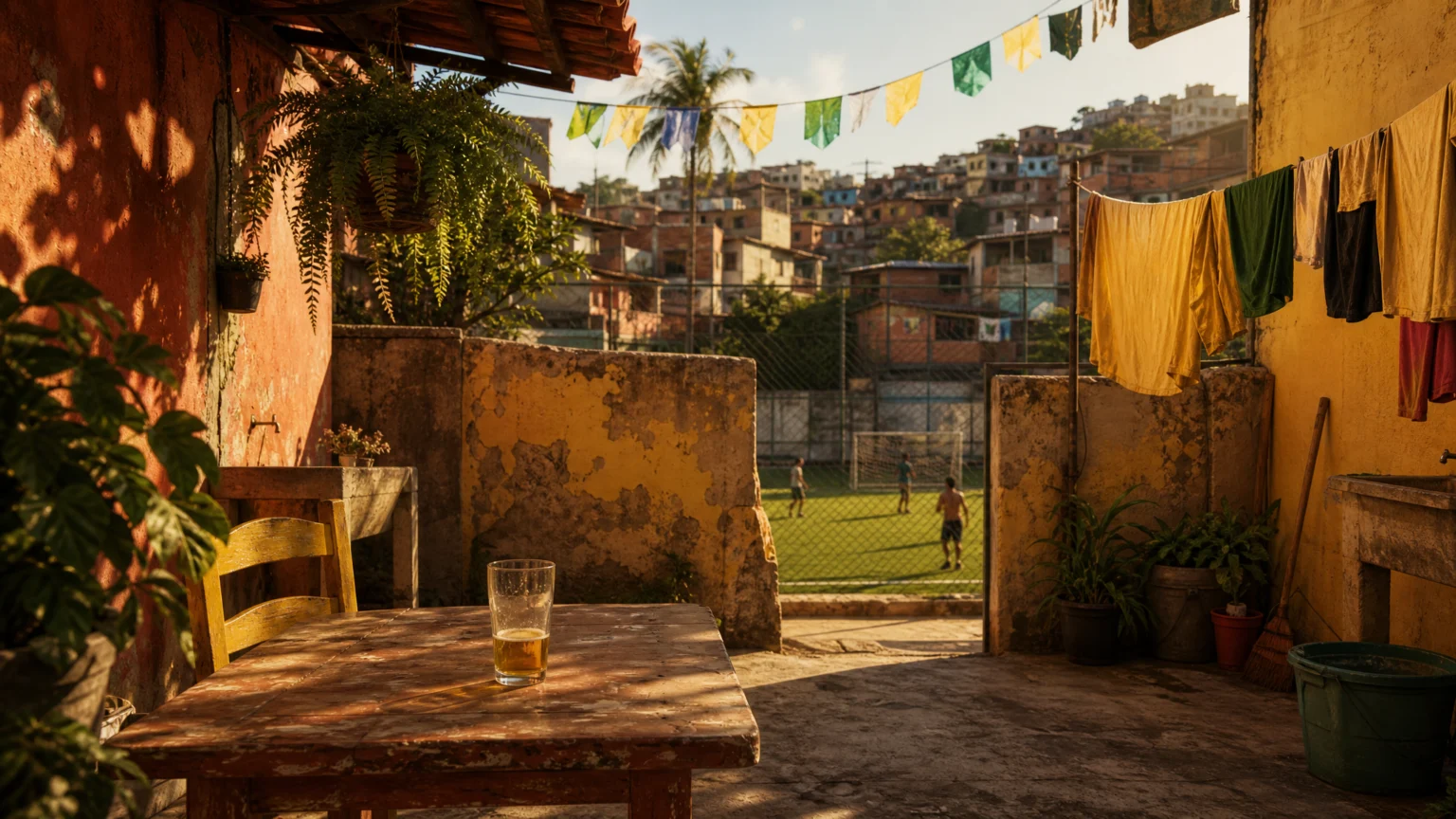
Before you register the subject, you feel the temperature. Rich tones and rough, dry-brushed surfaces make ordinary objects seem sunlit, handled, and lived in, as if the image holds the memory of a place before the viewer can name it.
That is where this São Paulo illustrator’s work gets its force. He draws from Brazilian everyday life and football culture, treating both as visual material rather than background. Terrace flags, bar glasses, stands, kits, and backyard light arrive with equal dignity, which is why the work feels personal without becoming private.
That balance matters in commercial design. A visual language grows stronger when it knows where it comes from, but it also needs enough structure to travel into commissions, campaigns, and public-facing brand work.
Heat works as image structure

Warm color can slip into shorthand very quickly. Here, it does more than decorate. The palette carries climate, memory, and social familiarity at once, so color does not sit on top of the drawing as styling. It sets the pace of how the image is read.
The artist describes Brazil as a warm country, with sun beating down on backyards and those colours living in the collective imagination of his people. That shifts color from personal preference to shared recognition. A viewer does not just see orange, ochre, or red; they feel a place becoming legible through them.
This helps explain why illustration can succeed where cleaner brand systems sometimes feel thin. When atmosphere is built into the palette, the image can carry emotion without leaning on sentimentality. Designers working on place-based identities may notice a parallel in this look at a neighborhood banner system led by place, where local detail gives the work its backbone.
Texture keeps memory from going smooth
The rough, dry-brushed surface does a second job. It interrupts perfection. Instead of flattening the scene into a neat poster language, texture leaves room for friction, age, and touch.
That matters because memory rarely arrives as a crisp vector. It comes with worn edges, uneven contrast, and partial recall. In visual terms, texture can suggest that human residue without making the work hard to read.
Commercial settings often press in the opposite direction: simplify, clean up, standardize. Sometimes that is necessary. But those moves can erase the signature that made the work distinctive in the first place. Used carefully, texture restores a sense of lived contact.
Football supplies a larger image bank
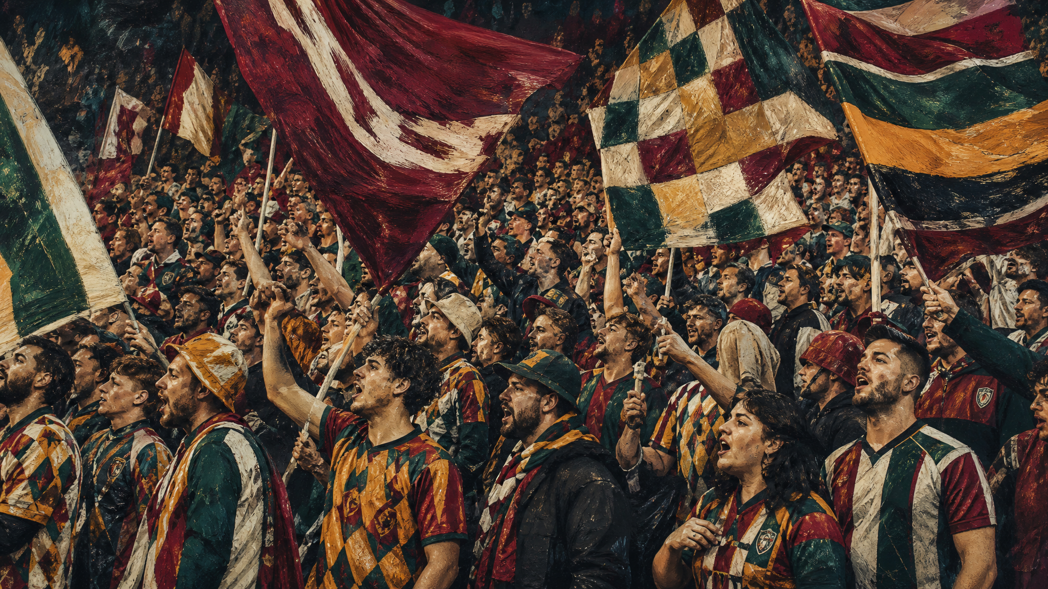
Football is central here, but not as a generic sports theme. It appears as a sociological phenomenon tied to Brazilian identity. That framing expands the creative field immediately.
Once football is understood as culture, the available material gets much richer. Flags waving in the stands, the richness of kit designs, and the small objects around fandom all come into view. The work can move from crowd energy to domestic memory without losing direction, because both belong to the same world.
That is a practical lesson for brand builders. Categories become more useful when you stop designing only for the official object and start noticing the surrounding surfaces, habits, and rituals. Sports branding especially benefits from that wider lens, as seen in this study of how football field logos reshape sports branding.
Design training gave the work a frame
The career path helps explain why the images feel expressive without losing control. He trained in graphic and digital design at the Istituto Europeo di Design and graduated in 2017. He had already been working in the industry since 2013, then chose illustration in 2019 as the thing he loved most.
That sequence matters. Design training often teaches hierarchy, restraint, composition, and client discipline. When an illustrator brings those habits into a personal visual language, the result can carry more weight in commercial settings.
For multidisciplinary creatives, the implication is straightforward. A move into illustration does not erase earlier design experience. It often sharpens it. Structure makes expressive work more usable, and expressive instinct keeps structure from going flat.
A clear point of view expands commercial range
The client list shows that a specific visual voice can travel. Commissions have included Nike, Itaú, ASICS, and illustrations for Nacione Branding’s World Cup typeface, UsMeCa. Nike also commissioned posters paying homage to his beloved team.
That range does not depend on the work becoming generic. If anything, the opposite seems true. The more clearly the artist defines his world, the easier it becomes for brands to recognize what they are commissioning: warmth, locality, public feeling, and a strong sense of image-making.
This offers a useful correction for teams that over-polish concepts before launch. Distinct work usually gets booked because it is distinct. If a brand wants movement later, the same principle still holds: keep the character intact, then extend it with care through tools like animated logos for social media or considered social media photo animation rather than smoothing away the original texture.
Ordinary scenes carry identity by accumulation

One of the strongest parts of the work is a personal project called Série Cotidiano, described as a love letter to everyday Brazilian life. He calls it a synthesis of the memories he has carried since first becoming aware of life.
That phrase clarifies the emotional logic behind the images. The project is not trying to summarize a country through monuments or official emblems. It stays with the ordinary scene: a backyard, a vessel, a flag, a crowd detail, a familiar object. Identity appears through accumulation.
For designers, this is a useful reminder. Representation often improves when symbols get smaller and observations get sharper. Instead of asking which icon stands for a place, it can be more effective to ask which repeated details people already recognize without explanation.
Visual language holds when its parts agree
There is a quiet confidence in work that knows its materials: warm colour, dry-brushed texture, football’s visual culture, and the stored memory of everyday life. None of these elements works alone. Their combination gives the illustrations depth.
The broader lesson is practical. Visual language becomes convincing when mood, subject, and surface all point the same way. Designers do not need this exact palette or subject matter to learn from it. They need to notice their own equivalent of the backyard: the recurring place, object, or public ritual that turns style into meaning.
 Icon Template
 Logo Template
 Photo Template
 Logo Template


